Academic character.
A distinctive signature.
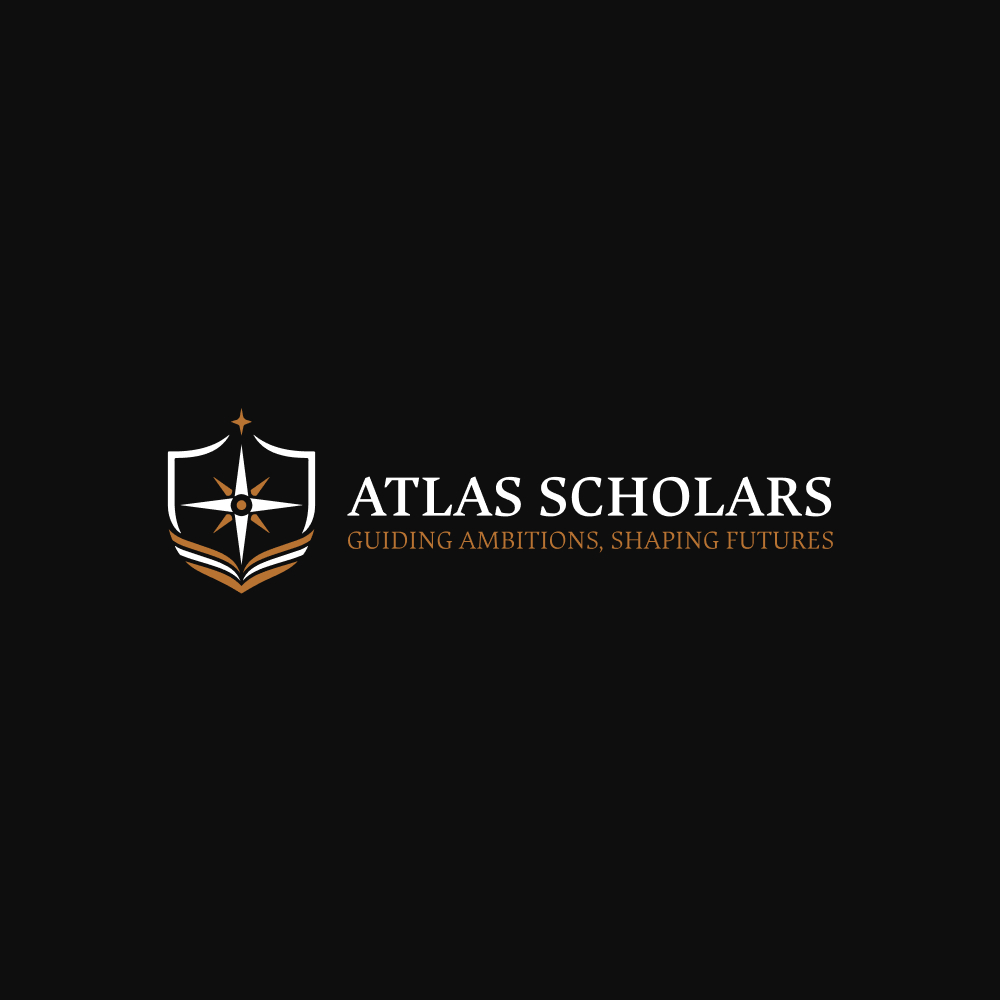
The emblem and serif wordmark establish a formal visual tone. Navy, bronze and white provide a consistent foundation across the supplied logo versions.
A visual identity and website for an education-guidance brand, connecting an academic character with a clear digital presence.
↓
Atlas Scholars supports Moroccan students and families considering study abroad. Its website introduces the organization, explains its services and helps visitors explore study destinations.
My work covered the logo and website design, alongside selected social posts. This case study focuses on the relationship between the identity and the digital experience.
The emblem and serif wordmark establish a formal visual tone. Navy, bronze and white provide a consistent foundation across the supplied logo versions.
The website gives the brand room to explain its approach, introduce its support and direct visitors toward further information or a conversation.
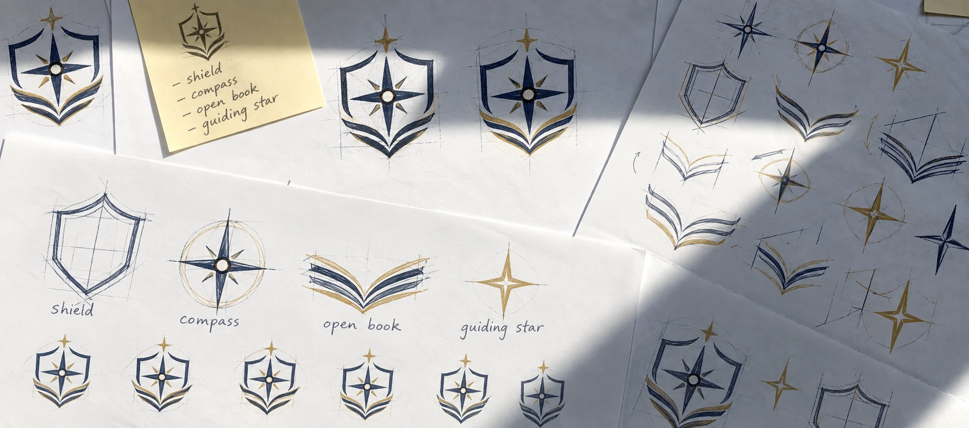
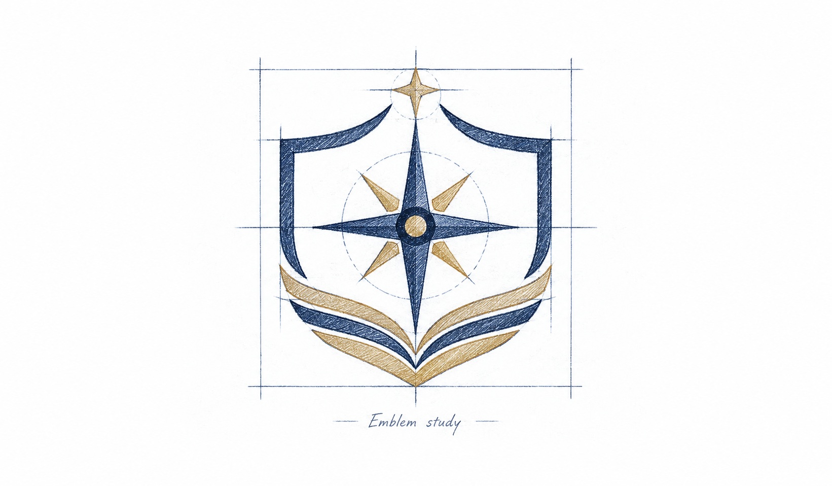
The supplied emblem brings together compass-like points, an enclosing shield and an open-book form. Read together, these elements suggest direction, assurance and education.
A serif wordmark gives the name an academic presence. The tagline sits beneath it, while the emblem works in both the stacked and horizontal arrangements shown here.

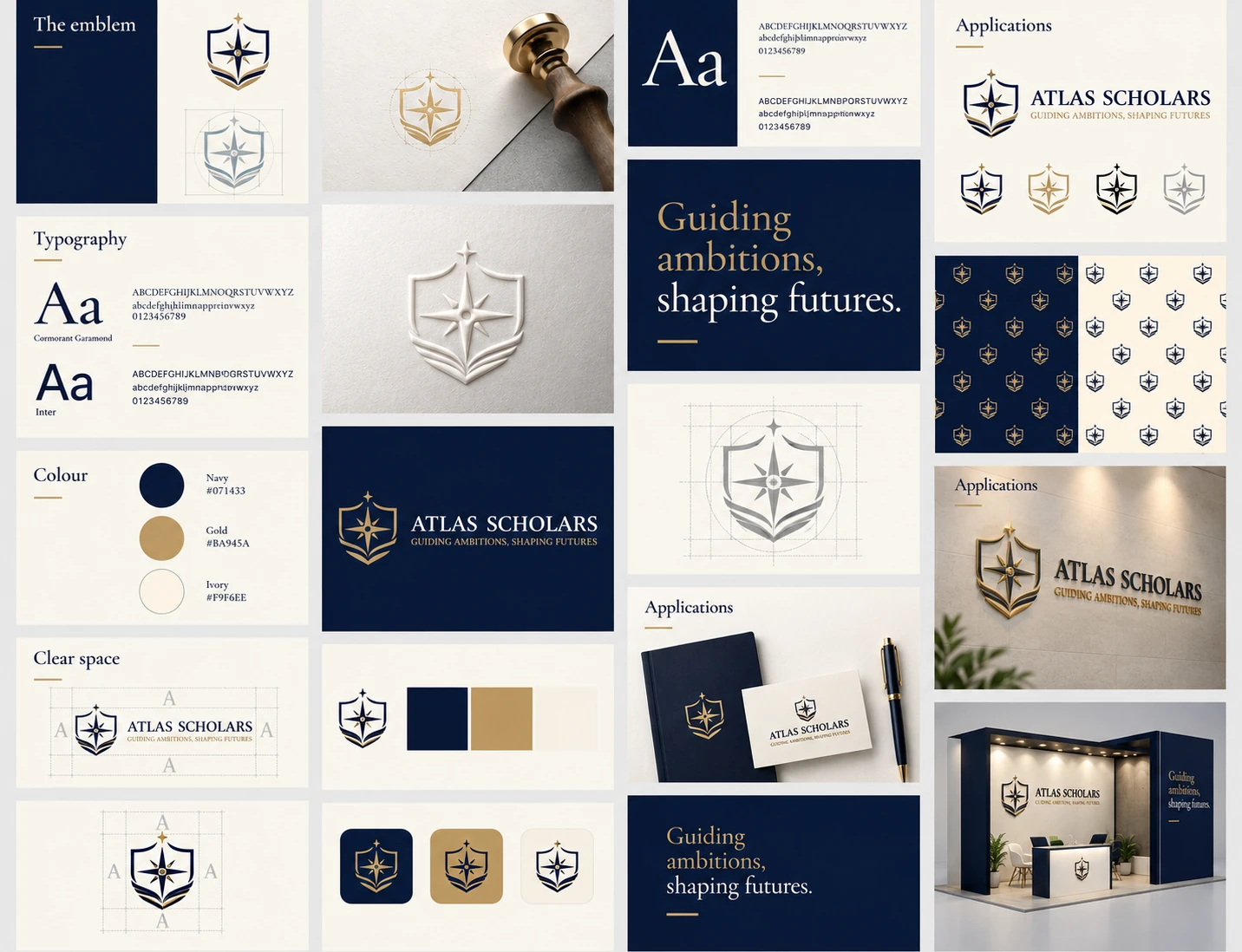
The compass, shield and open book are brought together in these presentation studies, followed by an overview of the visual system.
A clear signature.
A consistent presence.
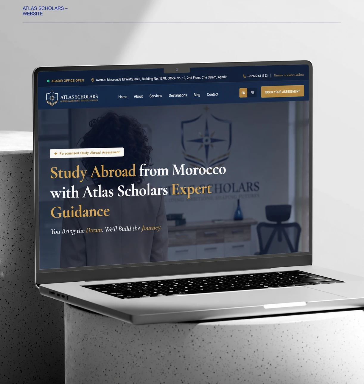
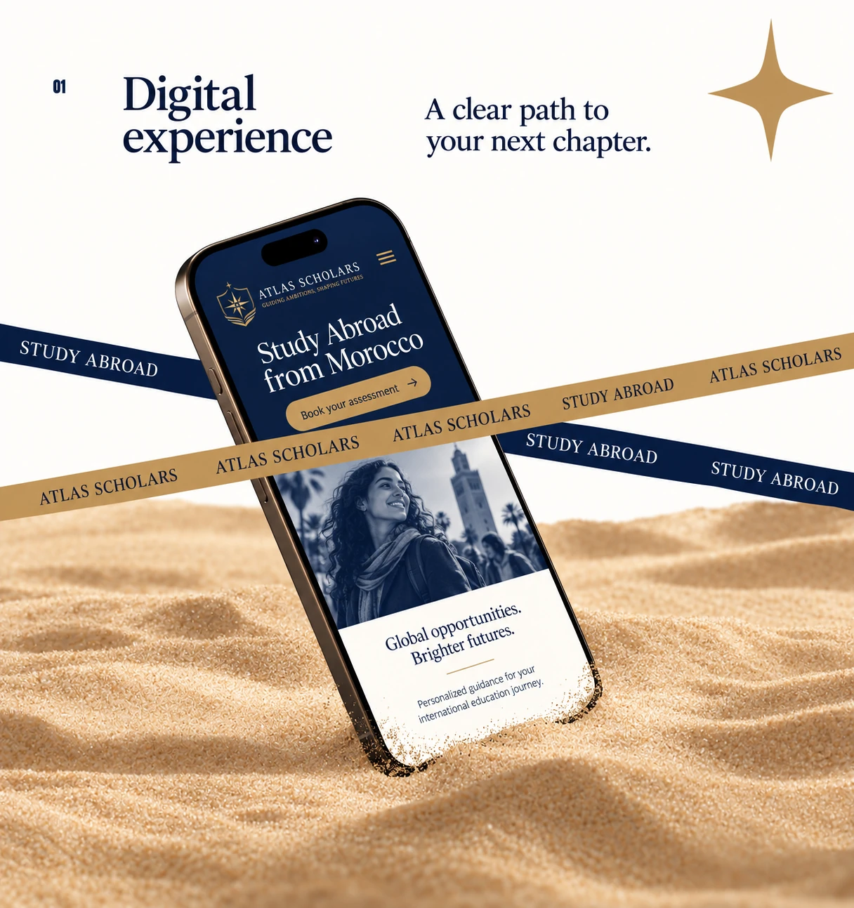
A consistent visual language carries the academic identity into the desktop and mobile experience.
The homepage pairs the brand’s navy and gold with a direct introduction to studying abroad and a visible route to an assessment.
The mobile presentation brings the wordmark, study-abroad message and primary action into a compact, focused composition.
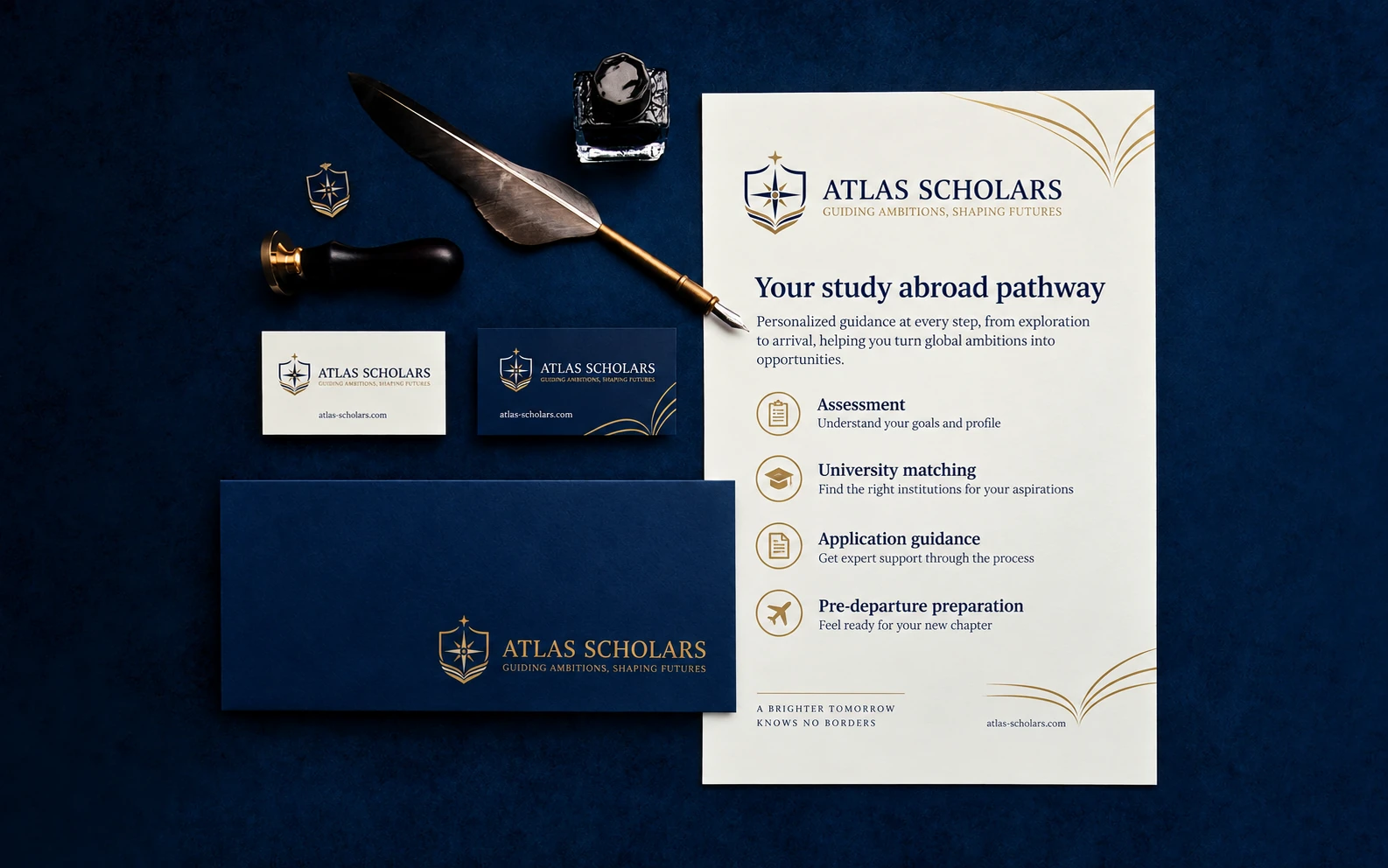
A collection of application mockups explores how the identity can move from personal objects to public spaces.
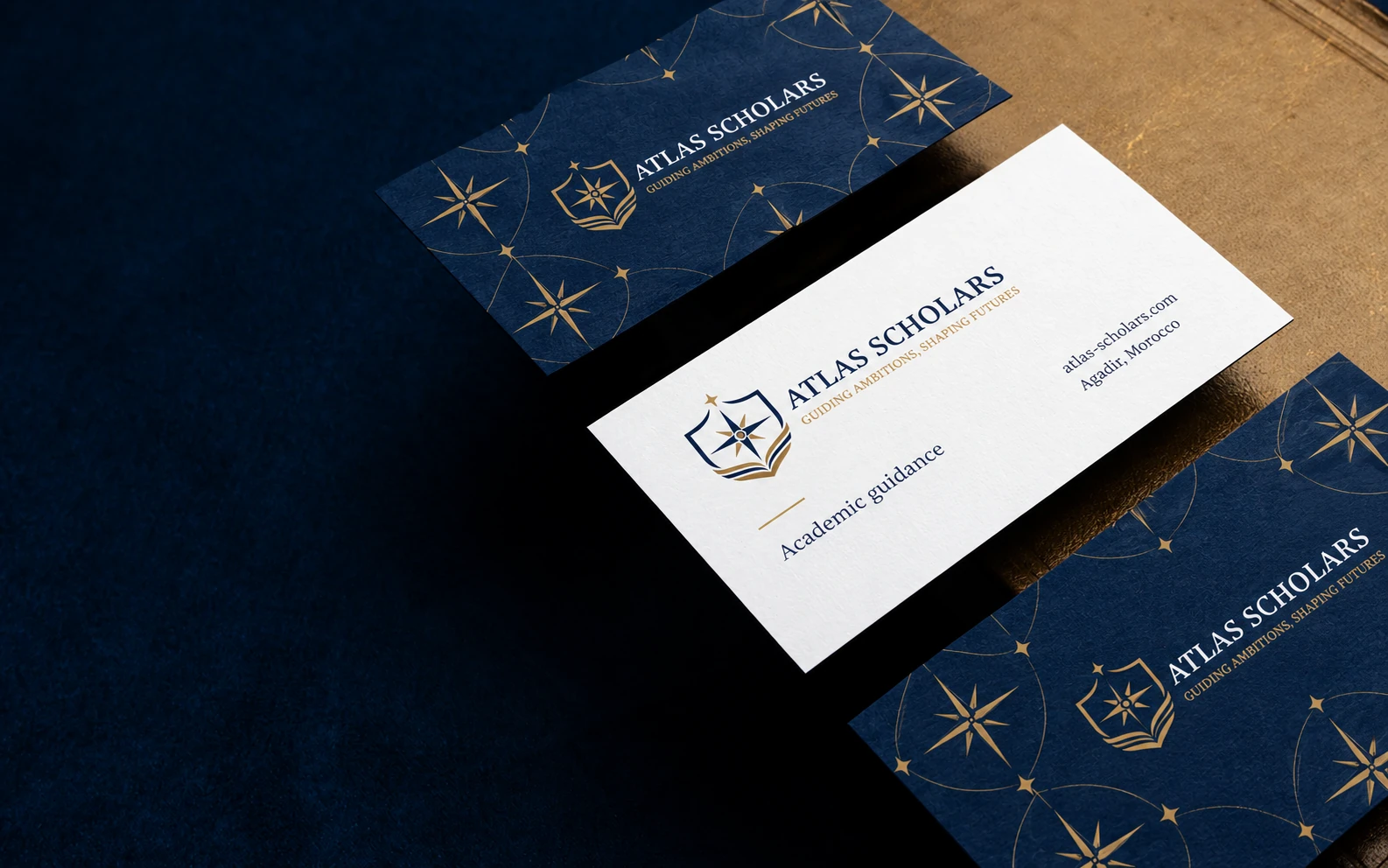
Stationery, cards and a pin bring the emblem into tactile settings, with the navy, gold and ivory palette holding them together.

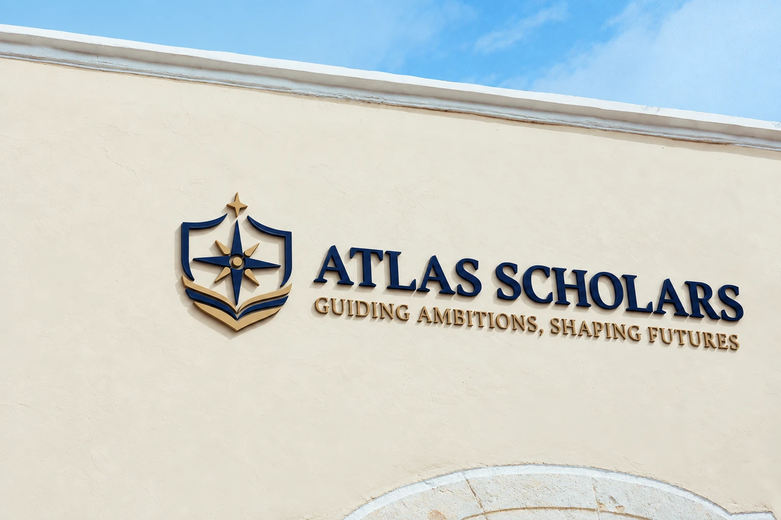
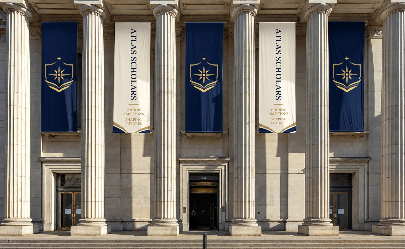
The mark takes on different roles across signage: a dimensional signature, a repeated banner and a large-format graphic.
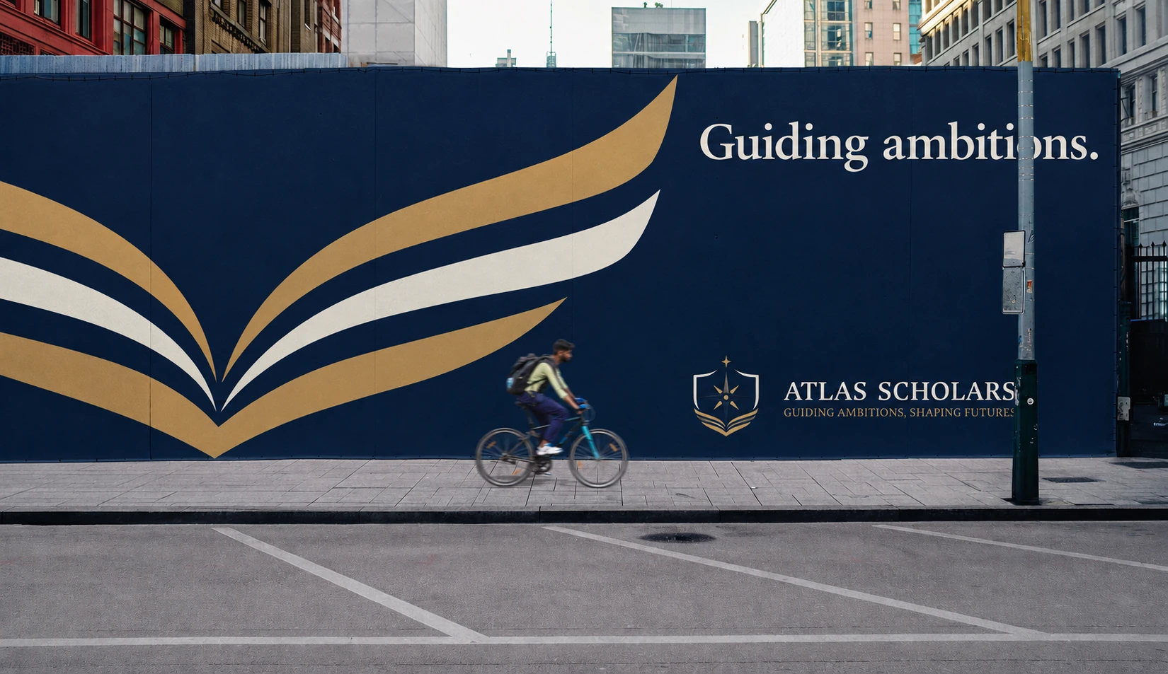
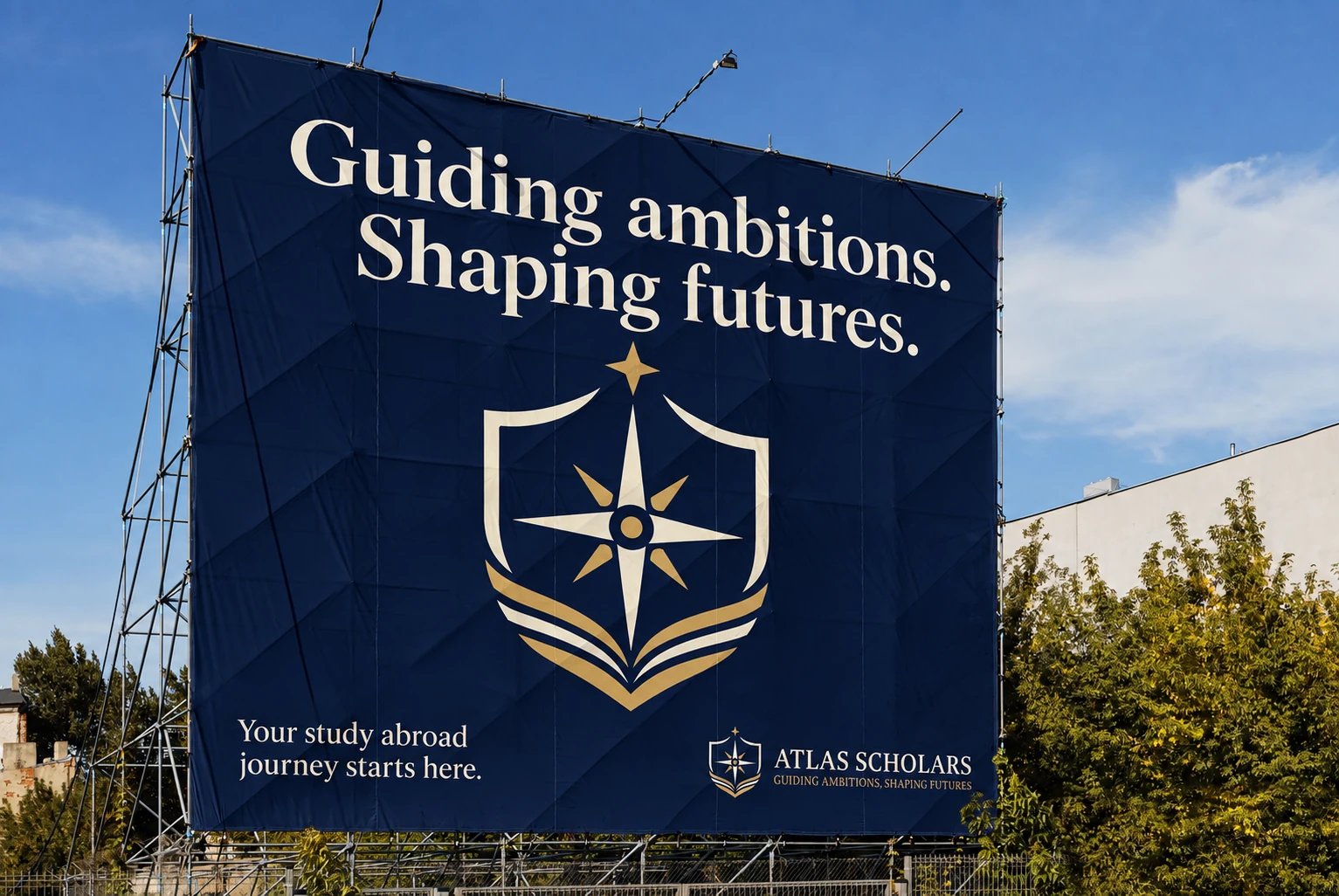
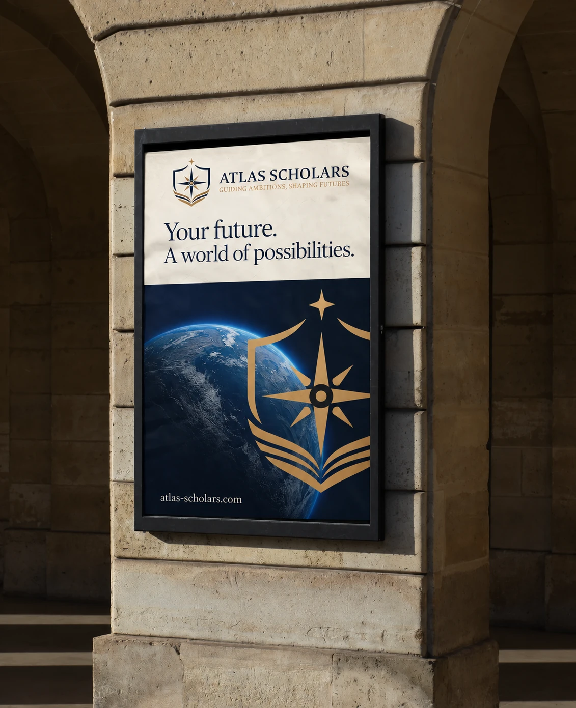
Apparel places the logo in a community setting. The closing campaign composition shows how imagery, graphic motifs and the wordmark can work together across a family of layouts.

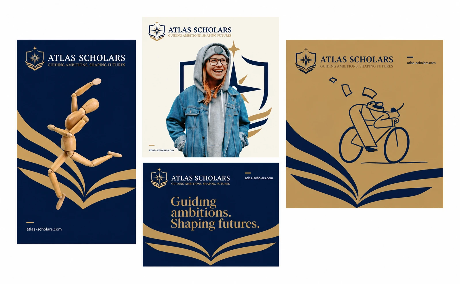
Application images are presentation mockups. The current website may have evolved since the designs presented here.