Find someone suitable.
Know what happens next.
Relevant skills, location, availability and reviews help frame the choice. The request and conversation screens provide space to explain the job before moving forward.
A repair to make.
The right person to find.
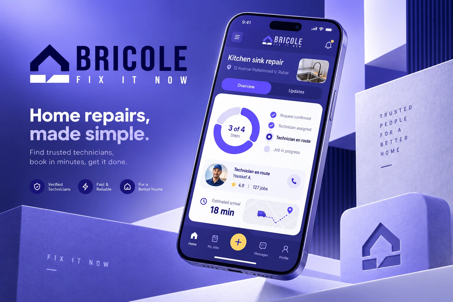
A mobile app design that brings finding a technician, discussing a job and arranging a service into one connected journey.
↓
Repair and maintenance start with a practical need. The design challenge is to help a client describe that need, find a relevant professional and understand how to proceed.
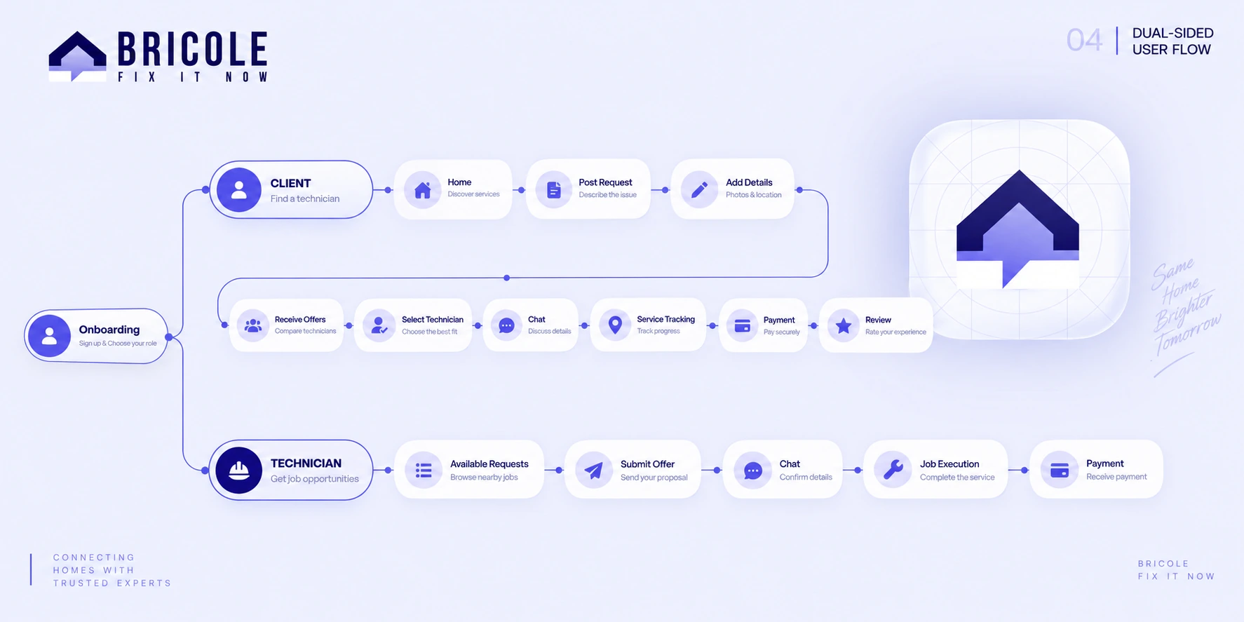
Bricole explores that experience from both sides: clients looking for help and technicians looking for suitable jobs. The project brings together discovery, profiles, requests, conversation and payment screens.
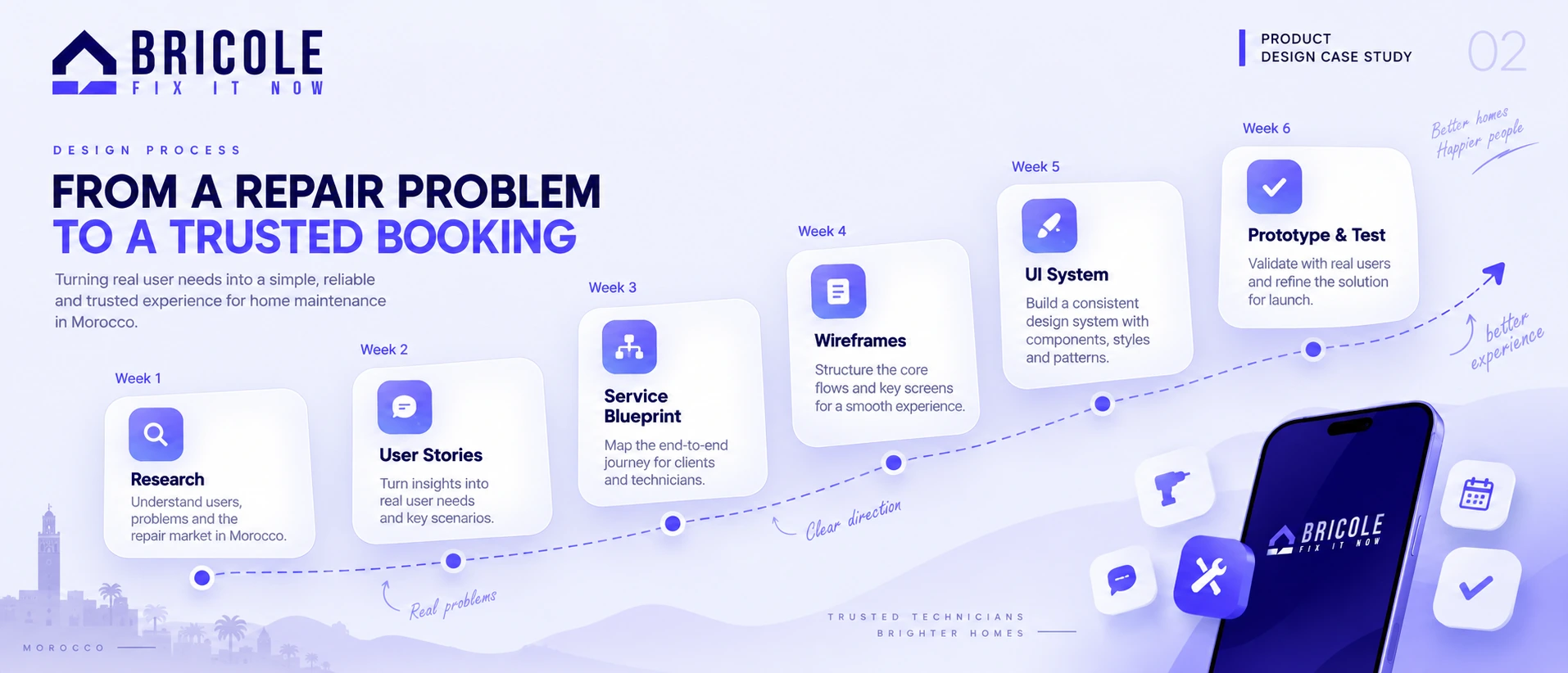
The original presentation frames the experience through client and technician personas. Their needs give the interface two different starting points.
Relevant skills, location, availability and reviews help frame the choice. The request and conversation screens provide space to explain the job before moving forward.
A separate path makes room for incoming opportunities, offers and client conversations. The flow considers how a technician moves from discovering a request to discussing the work.
The supplied competitor matrix compares search, filters, profiles, reviews, booking, communication and payment. These categories help explain the product’s scope.
The personas and comparison are project artifacts. They provide context for the design; they are not presented here as proof of current competitor capabilities or measured user behaviour.
Find the person.
Clarify the job.
Arrange the service.
This edited walkthrough groups the original flows into four moments. Each one answers a different question for the person using the app.
Browse service categories and relevant professionals.
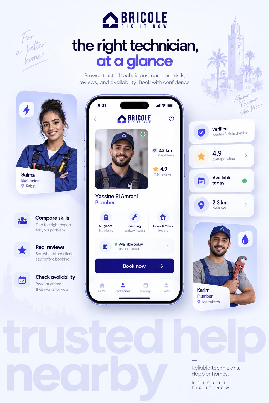
Review profiles, location, ratings and availability.
Describe the request and discuss it with a technician.
Explore payment, confirmation and review screens.
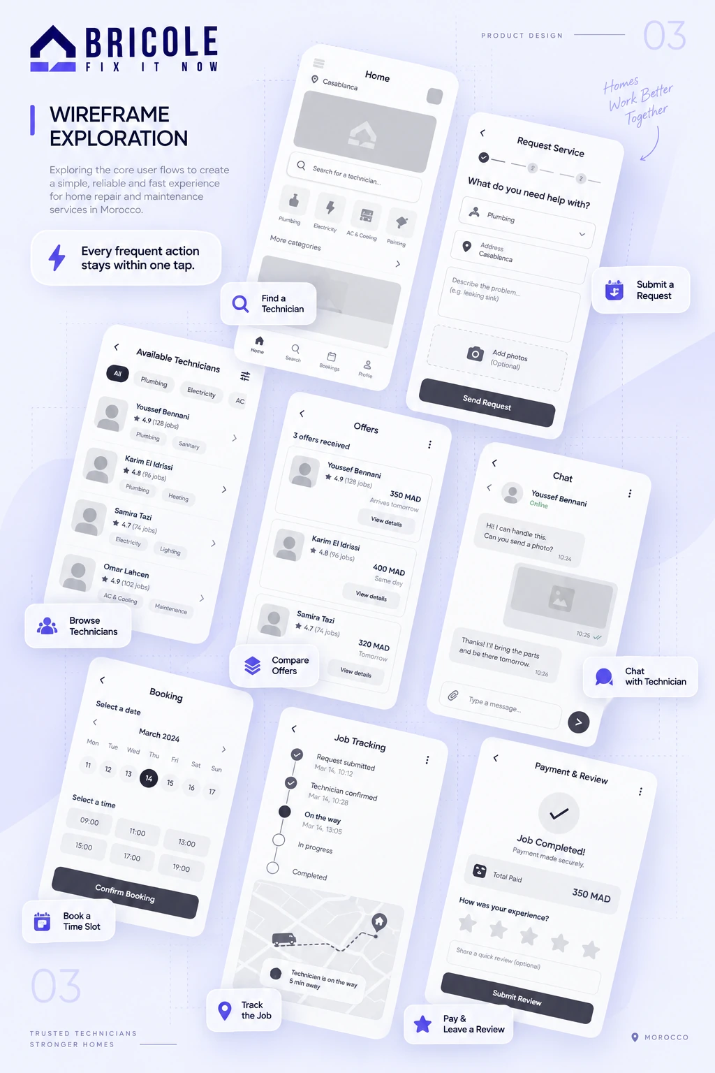
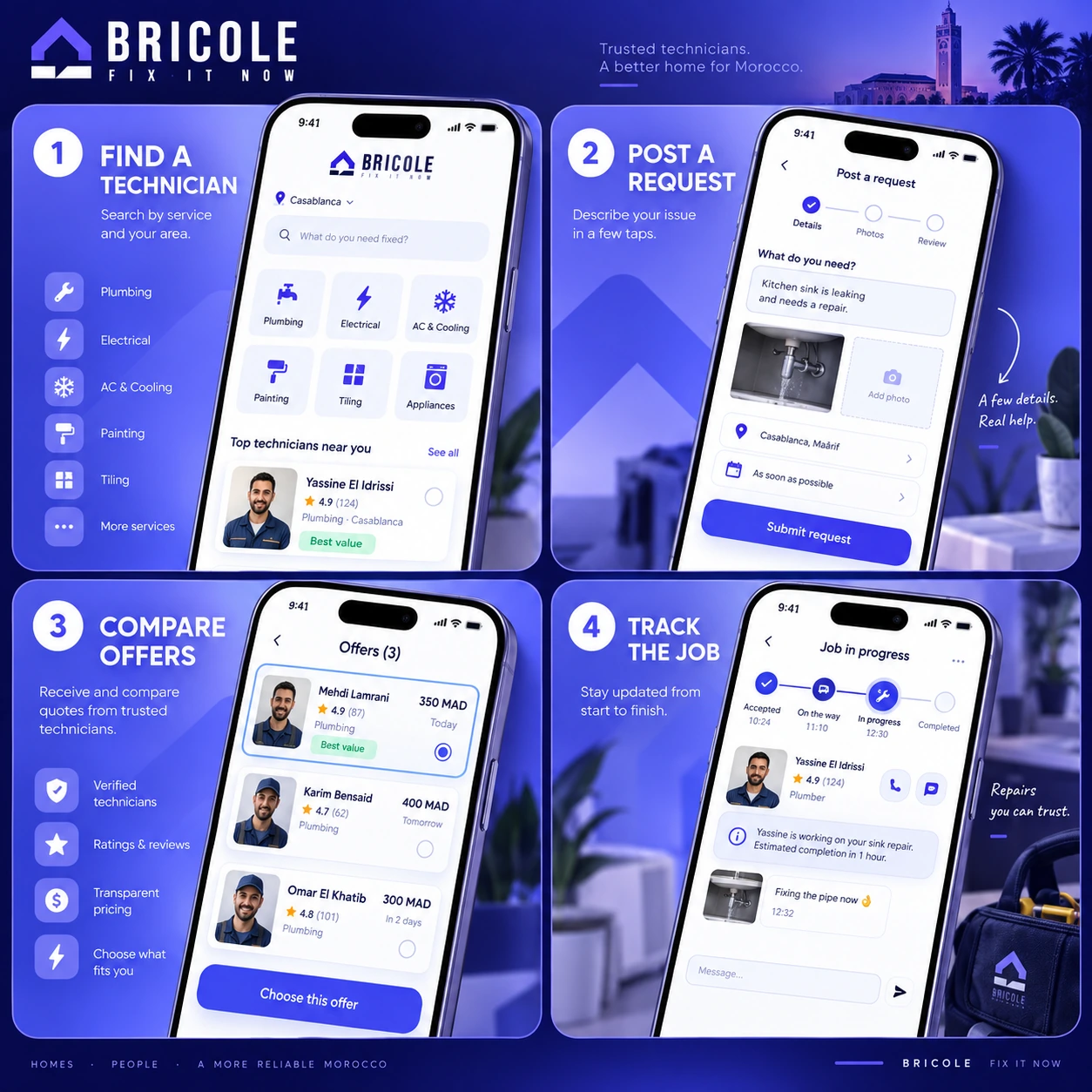
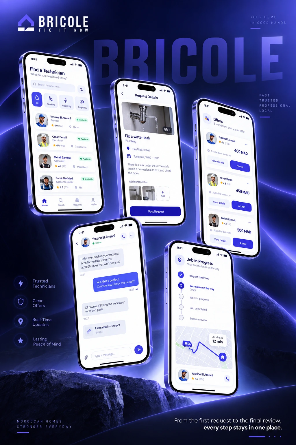
Category browsing introduces the available services. Profiles bring identity, location, ratings and scheduling information into the decision.
The supplied screens place categories and recommended technicians near the start of the journey. The profile view then adds detail before the next action.
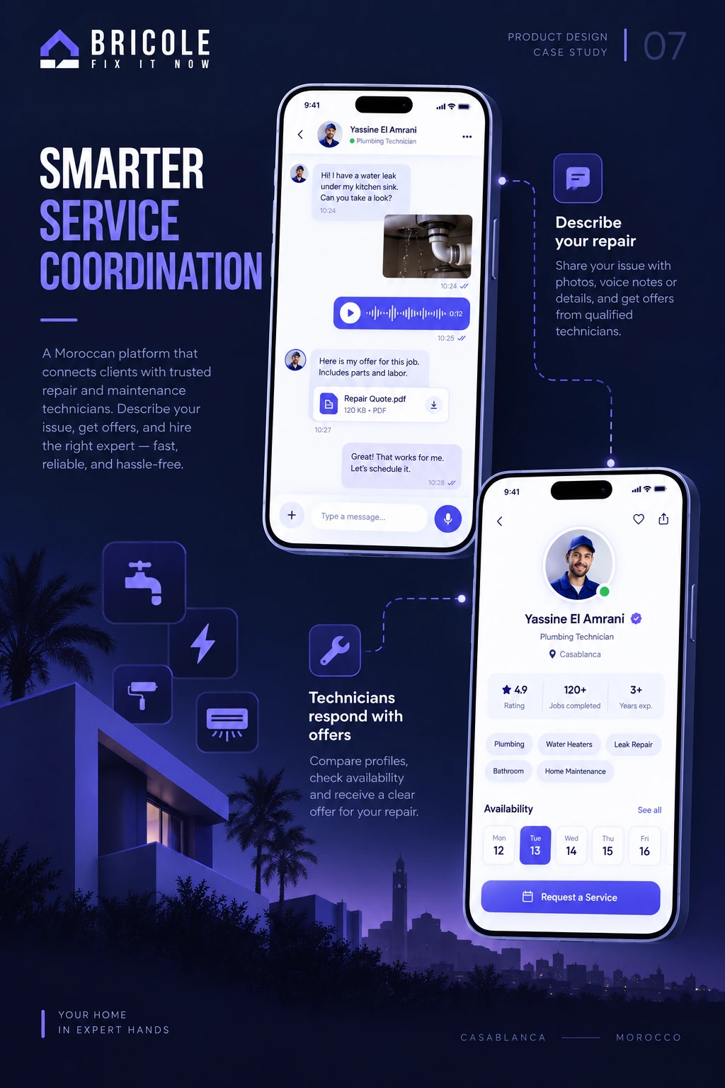
The request path includes space for job details and imagery. Messaging provides a place to clarify the task. The presentation also explores image-assisted problem identification as a proposed feature.
These screens communicate the intended interaction, without claiming a validated AI diagnosis or a deployed service.
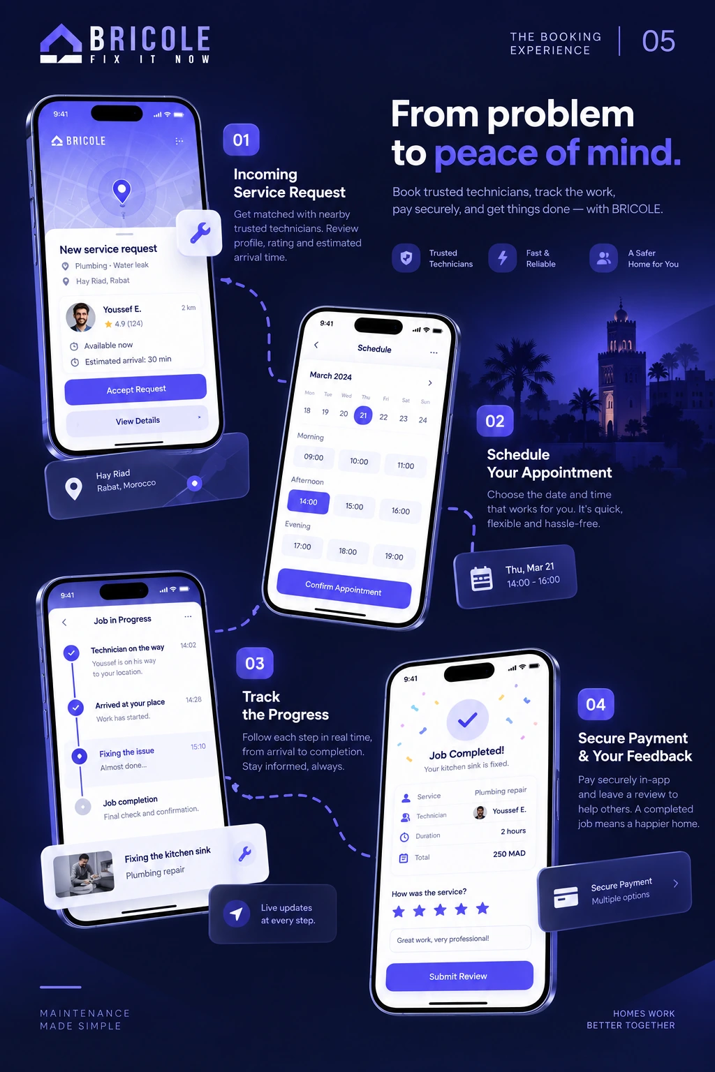
The UI includes payment-method selection, a confirmation state and a review form. These views extend the journey beyond finding a professional and into the follow-up after a service.
The dashboard presentation groups active requests, completed work and service activity into a focused overview. Figures shown are illustrative interface content, not measured product results.

Deep indigo anchors the interface, violet adds emphasis and pale lavender supports quieter surfaces. The supplied system uses Plus Jakarta Sans in regular, medium, semibold and bold weights.
The guideline board brings the typography and colour palette together. These choices connect the discovery, booking and technician screens across the presentation.
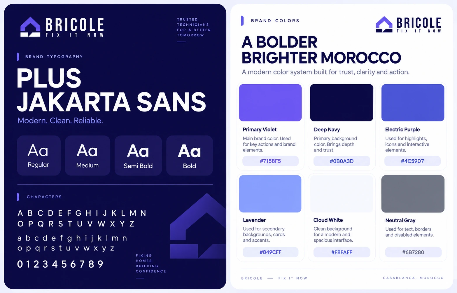
Bricole’s design connects discovery with the practical steps that follow: understanding a professional, explaining a task and arranging the service.
A shared visual system can support two different roles without making every screen identical. The flows, wireframes and final UI show how those roles meet around a service request.
Task-based testing could examine whether clients understand the request flow and technicians can find relevant work. Completion rates, trust and the proposed image-assistance feature would need evidence beyond the presentation.
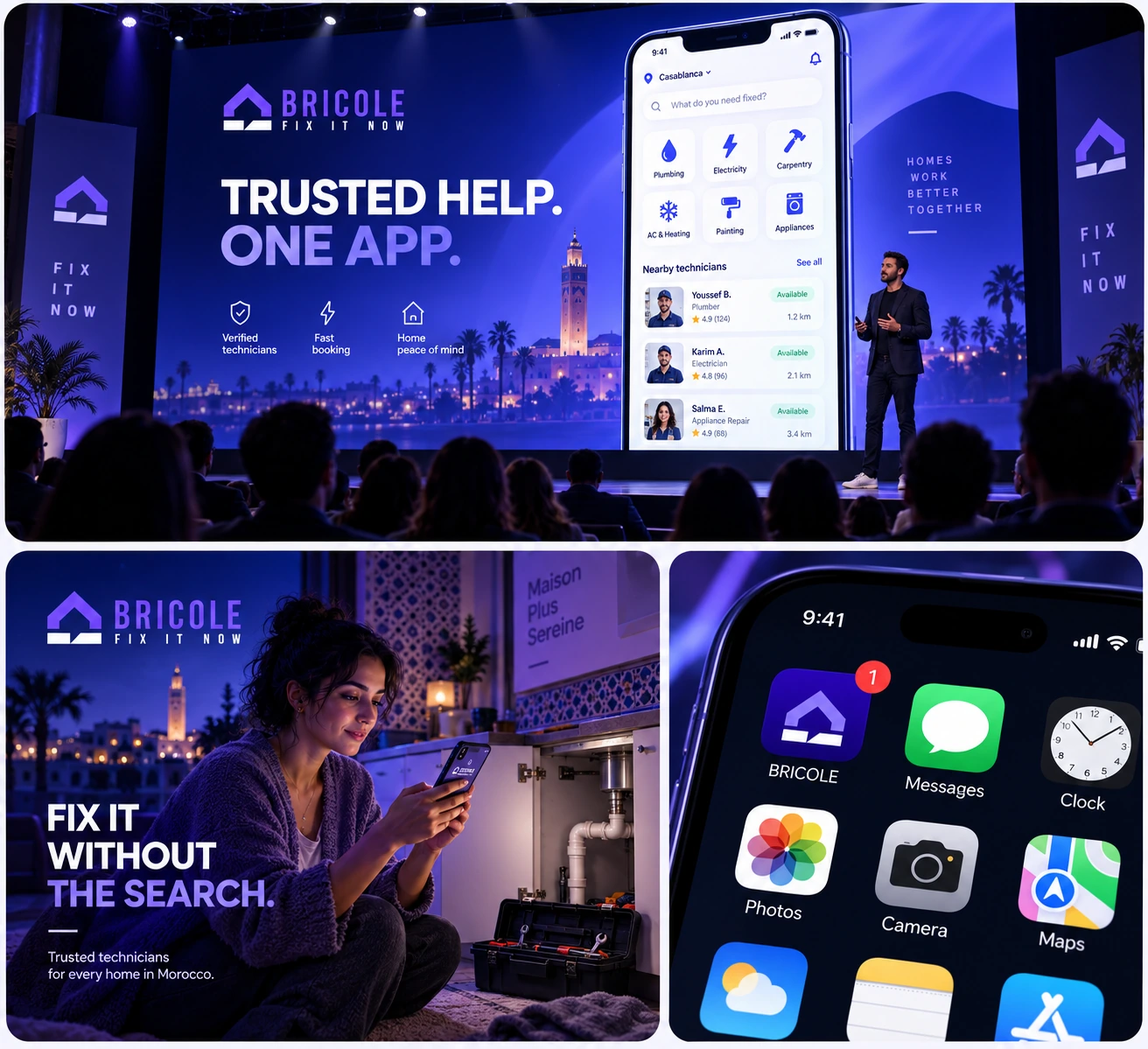
Design collaboration: Mustapha Id Boussdli & Aymane Marhoum. This case study presents design work and concept mockups, not verified launch, research or performance results.