TurkSource
Global.
Designed to travel.
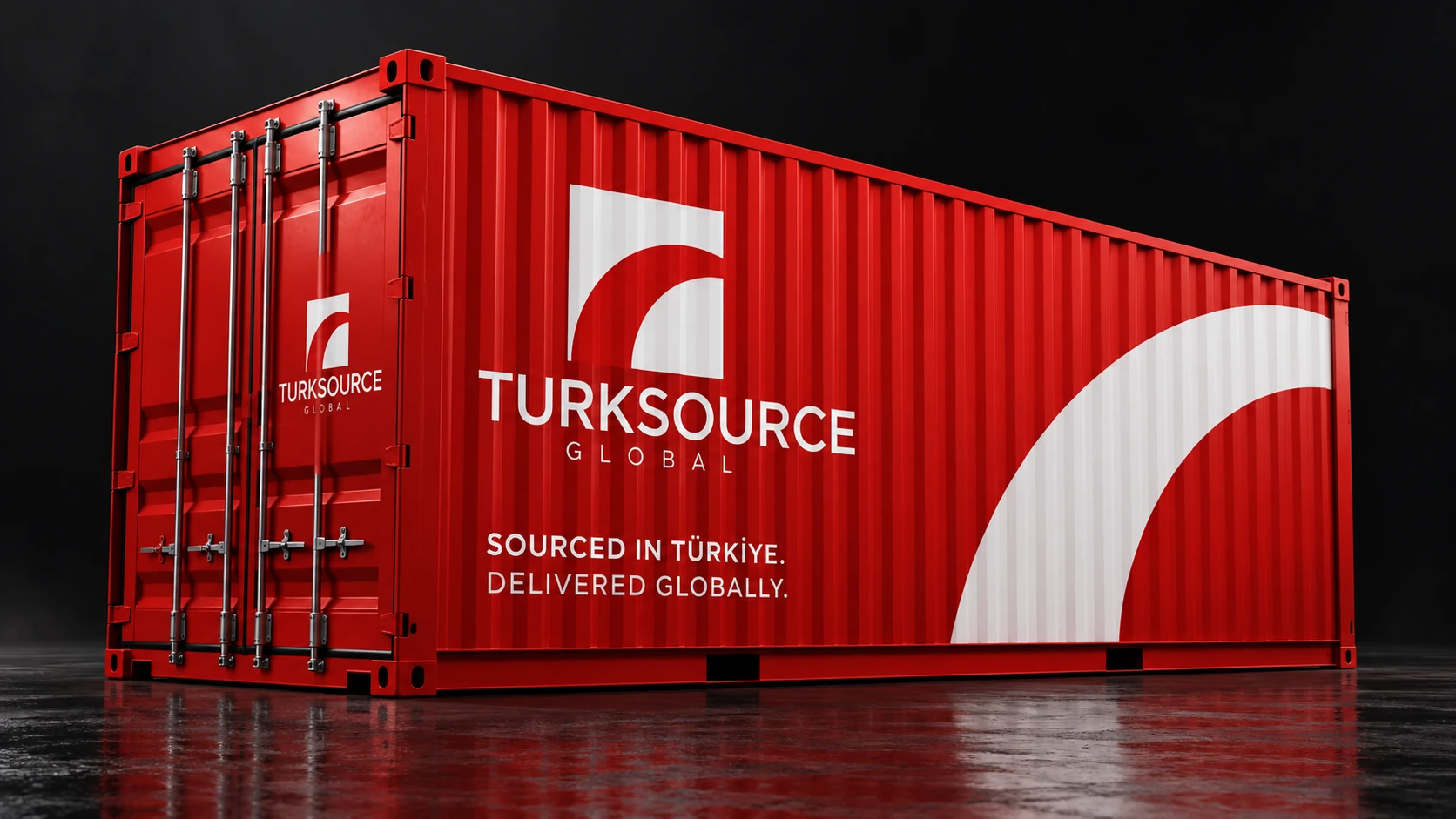
A red, white and black identity, connecting a distinctive symbol with the everyday materials of a sourcing and logistics brand.
↓
A clear mark.
A wider presence.
TurkSource Global works across sourcing, procurement and shipping connected to Turkey. The identity uses a direct visual reference to that connection: a white crescent-like form inside a red square.
My work brings this signature into a coordinated brand presentation, from the logo and printed materials to vehicle graphics and social-media design.
- Client
- TurkSource Global
- Designer
- Mustapha Id Boussdli
- Discipline
- Visual identity & graphic design
- Scope
- Logo, brand applications & social media
One identity.
Every scale.
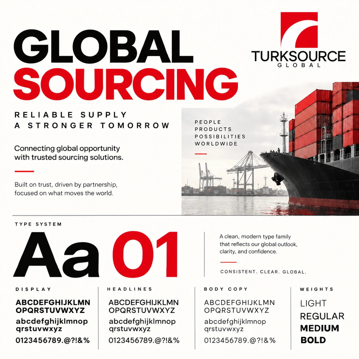
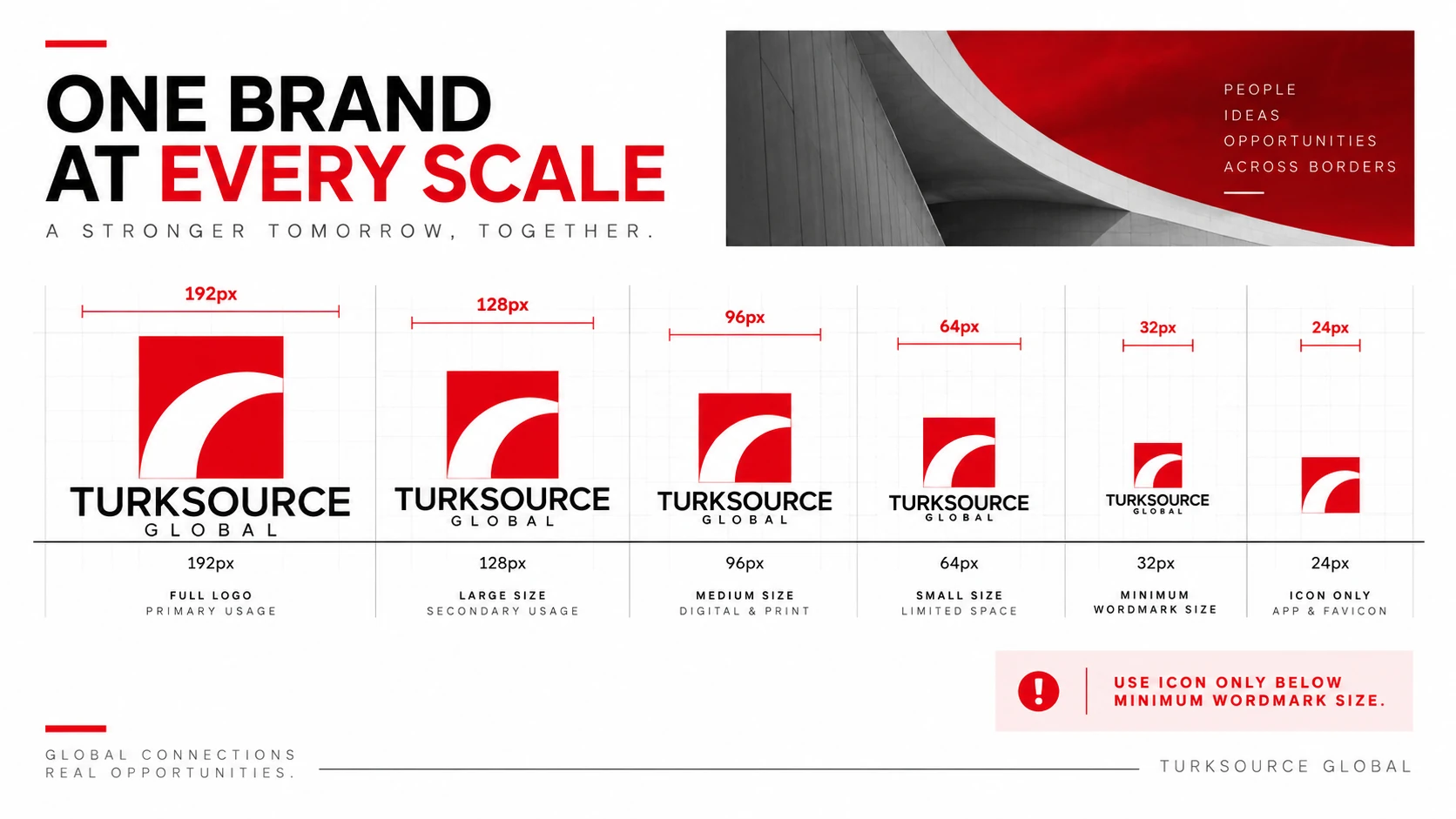
Bold typography, a disciplined red, black and white palette, and logo arrangements that move from a full signature to a compact symbol.
Built for
the journey.
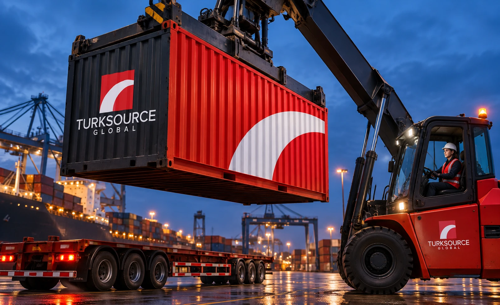
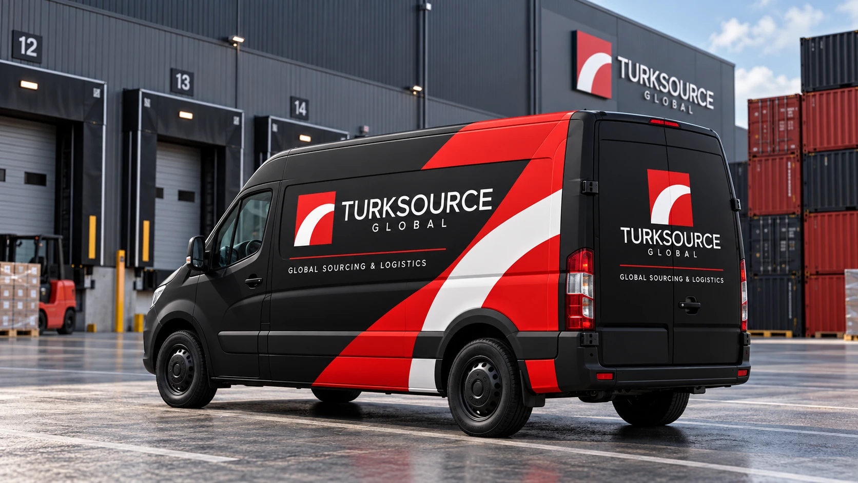
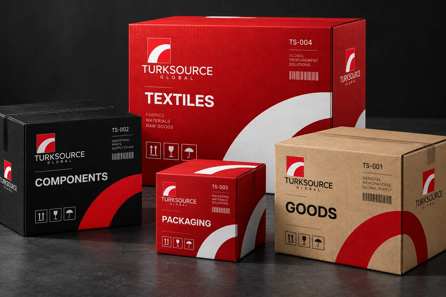
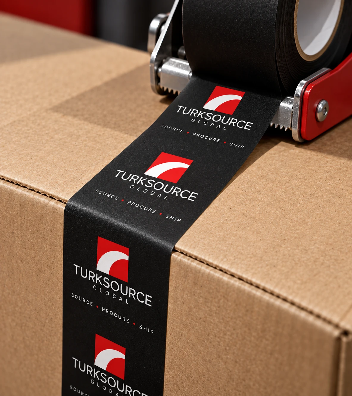
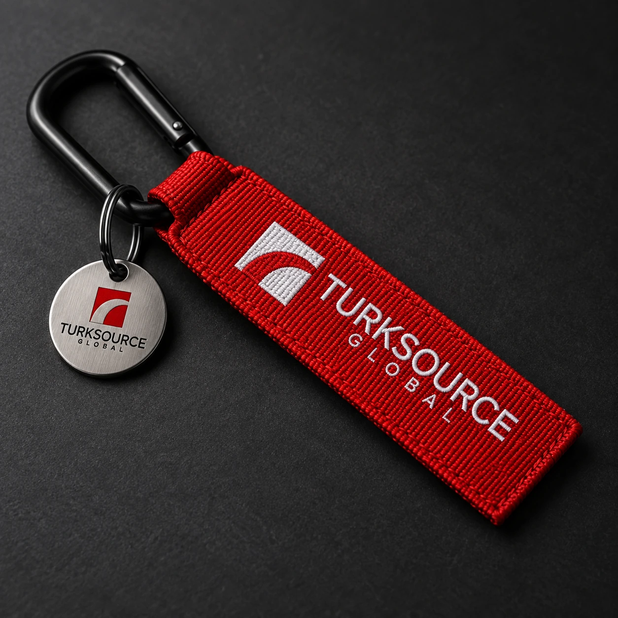
The curved motif carries across containers, fleet graphics and packaging. These application mockups explore the identity from large surfaces down to small handling details.


A brand
people wear.
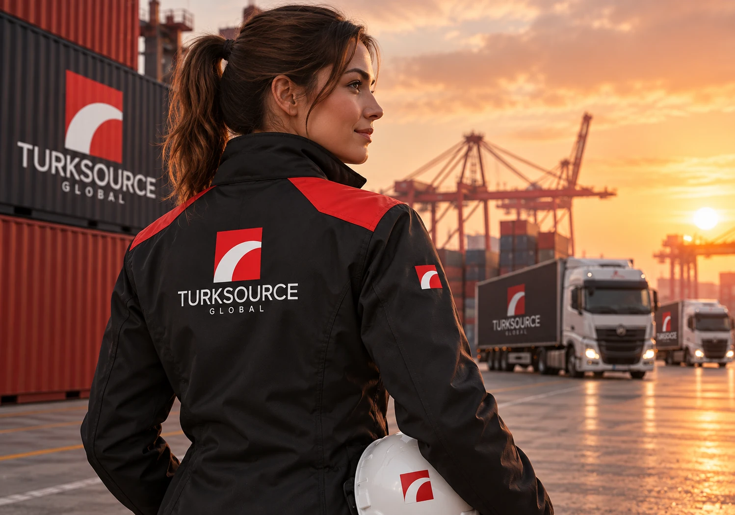
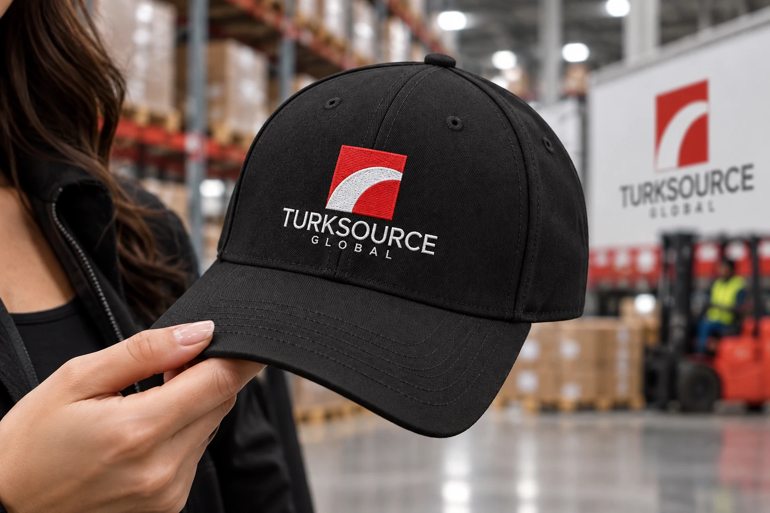
Embroidered details and red panels connect everyday apparel with the wider visual identity.

The same language.
On screen.
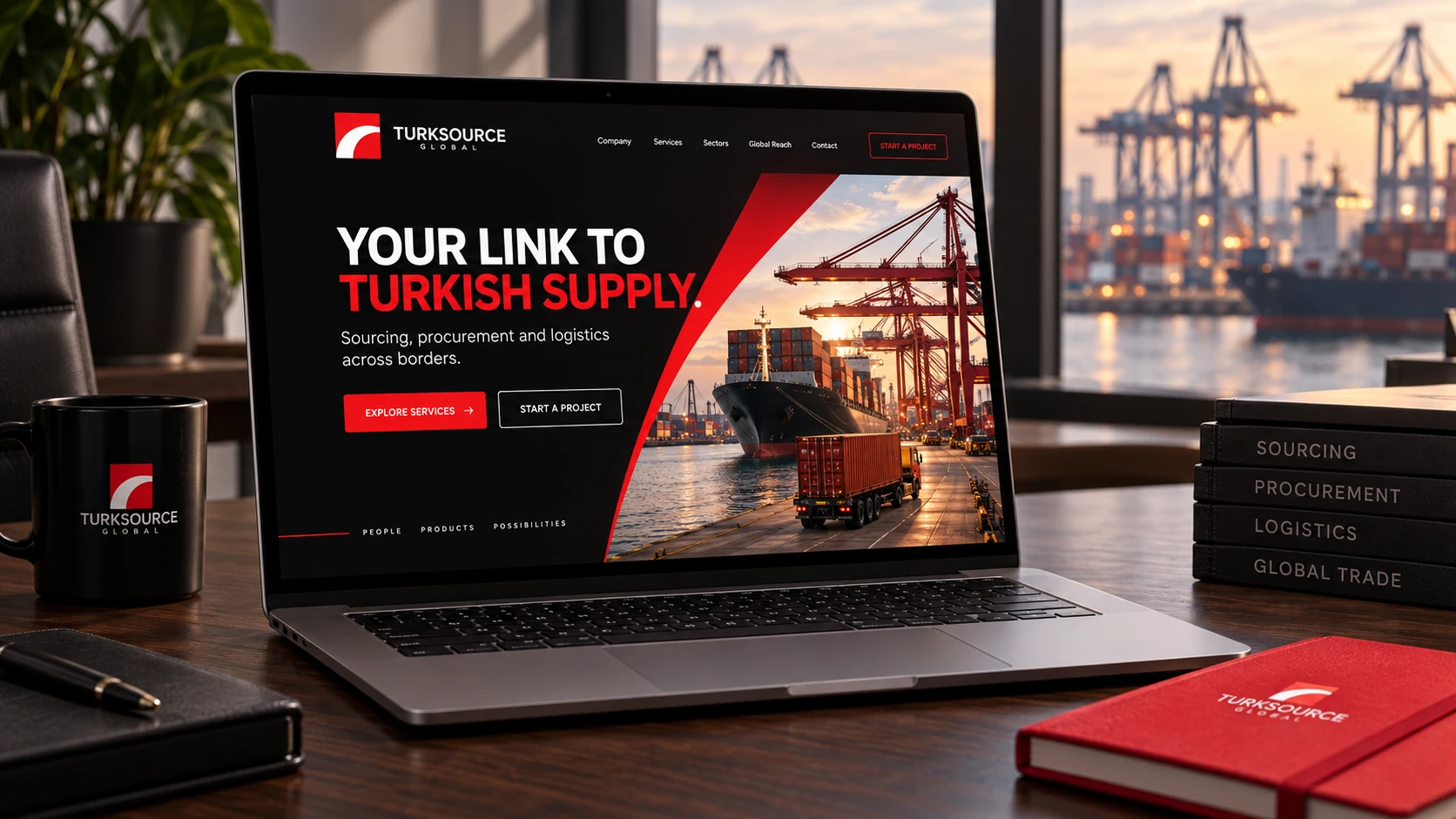
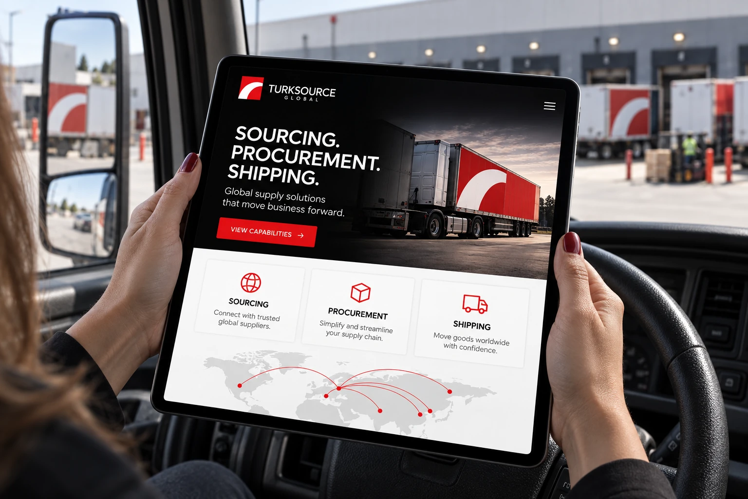
Desktop and tablet mockups explore the identity in a digital setting, with bold headlines, red actions and logistics imagery.
A presence
beyond the port.
Poster, billboard and installation mockups extend the identity into public spaces, pairing direct messages with the brand’s curved graphic motif.
Images are brand application and digital presentation mockups.