Yubo.
Start a conversation.
A bright social-app design exploration that brings discovery, live interaction and new connections into one mobile experience.
↓
A place to meet.
A reason to connect.
The presentation explores how people discover others, join live sessions and build connections. A clear mobile hierarchy supports a lively visual direction, with gradients giving key actions and brand moments a recognisable signature.
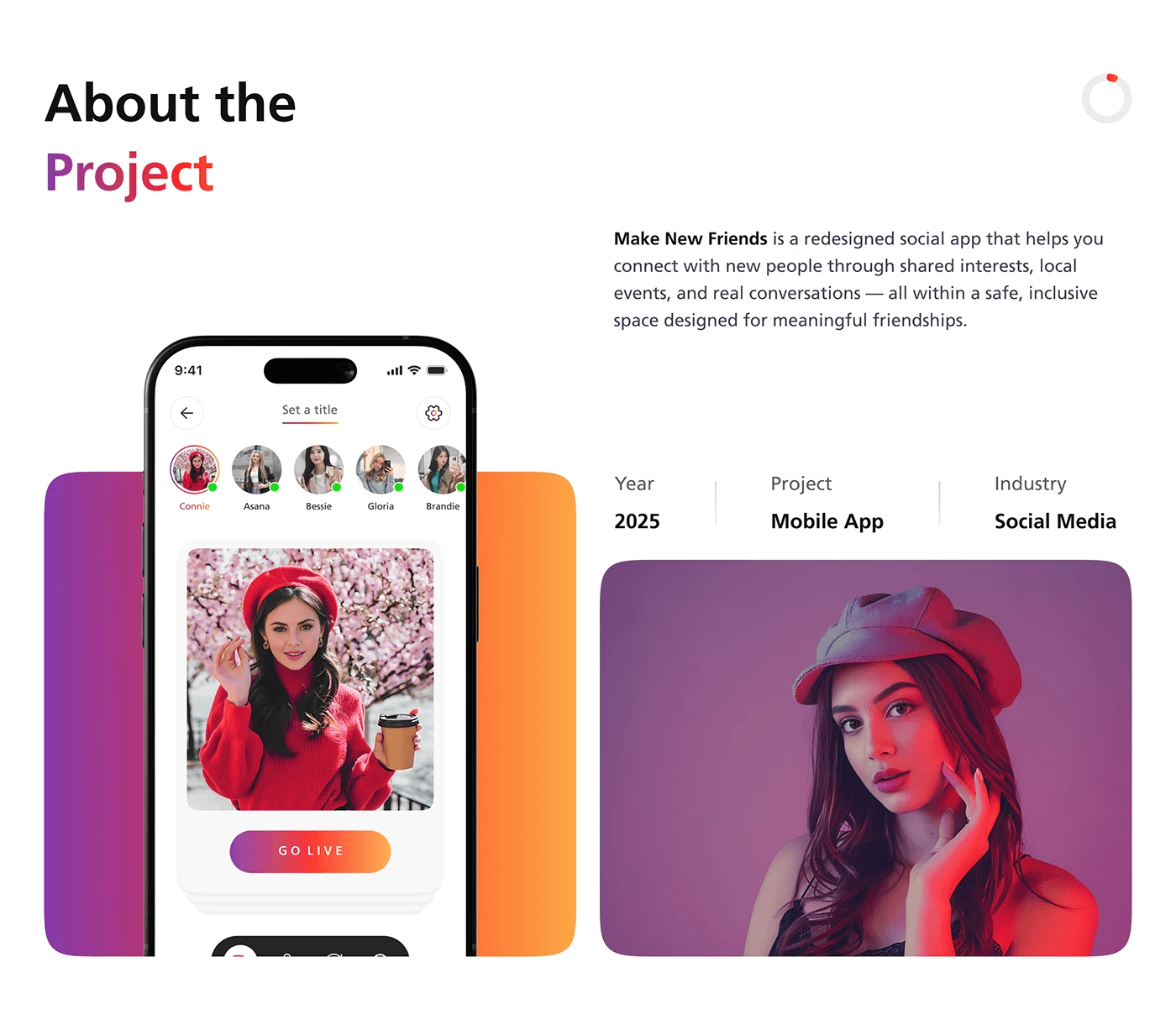
From first tap
to conversation.
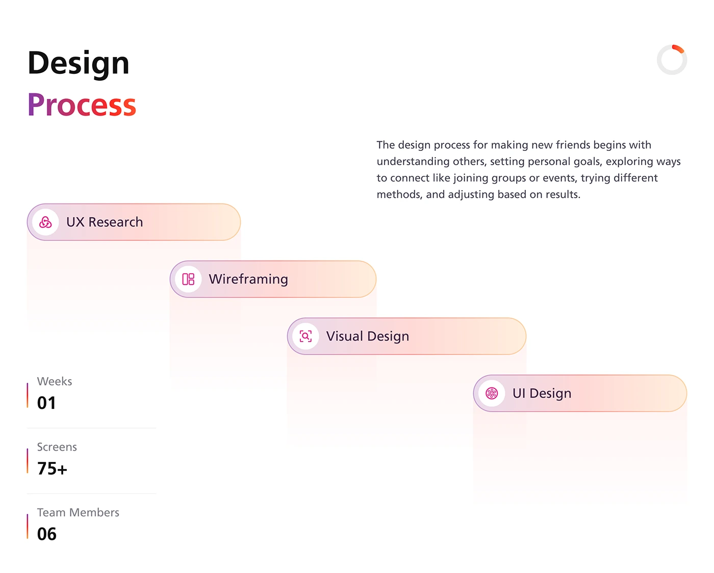
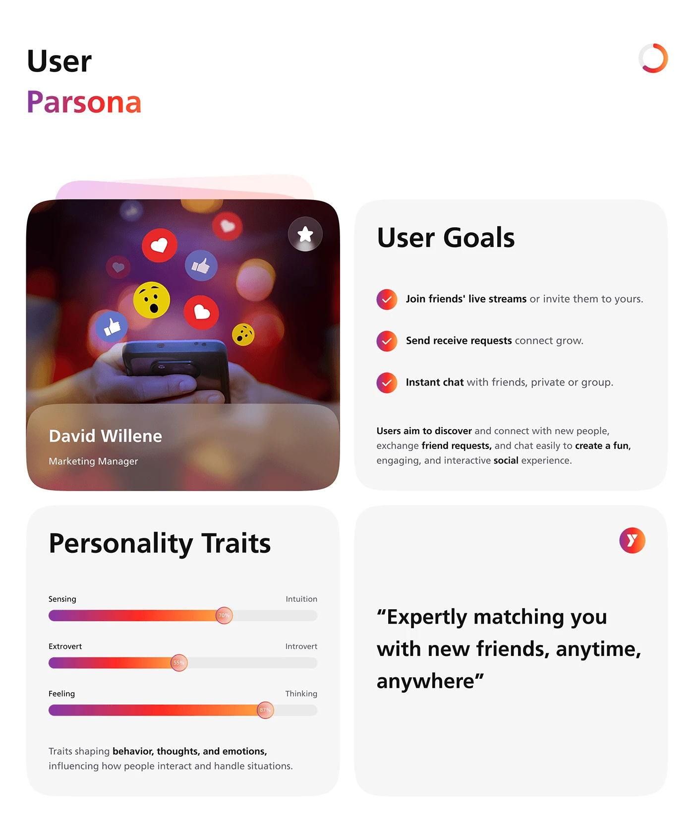
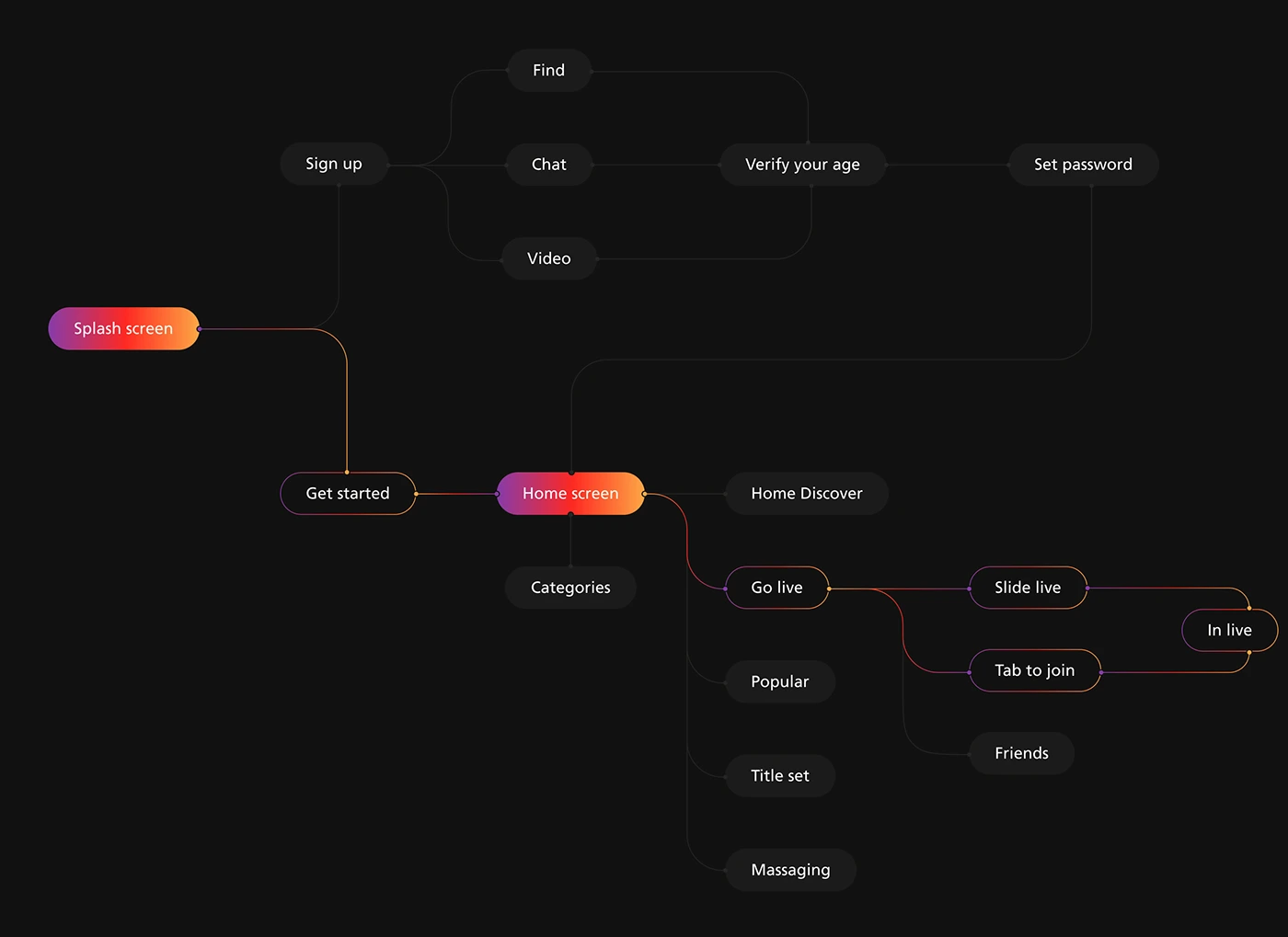
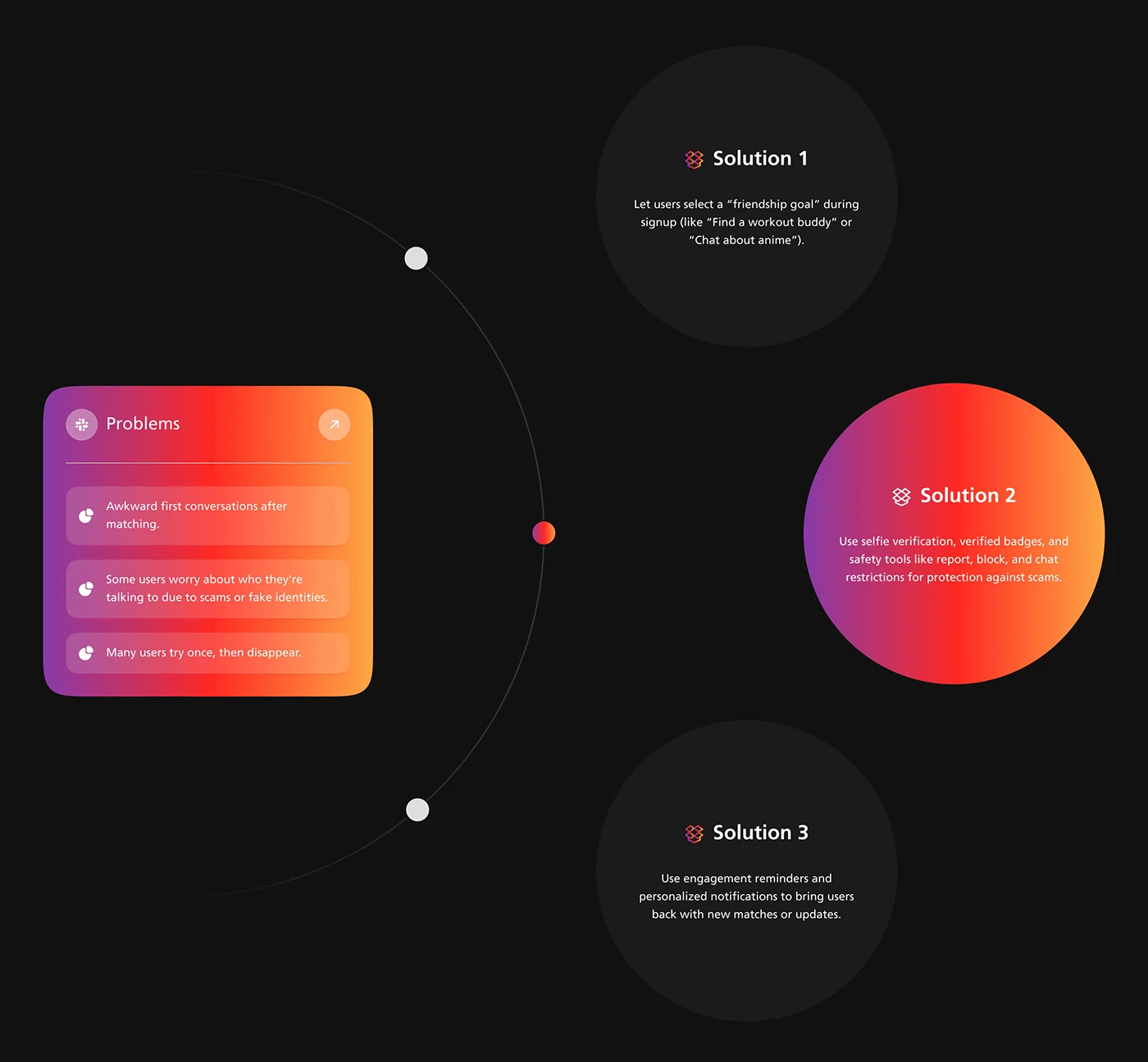
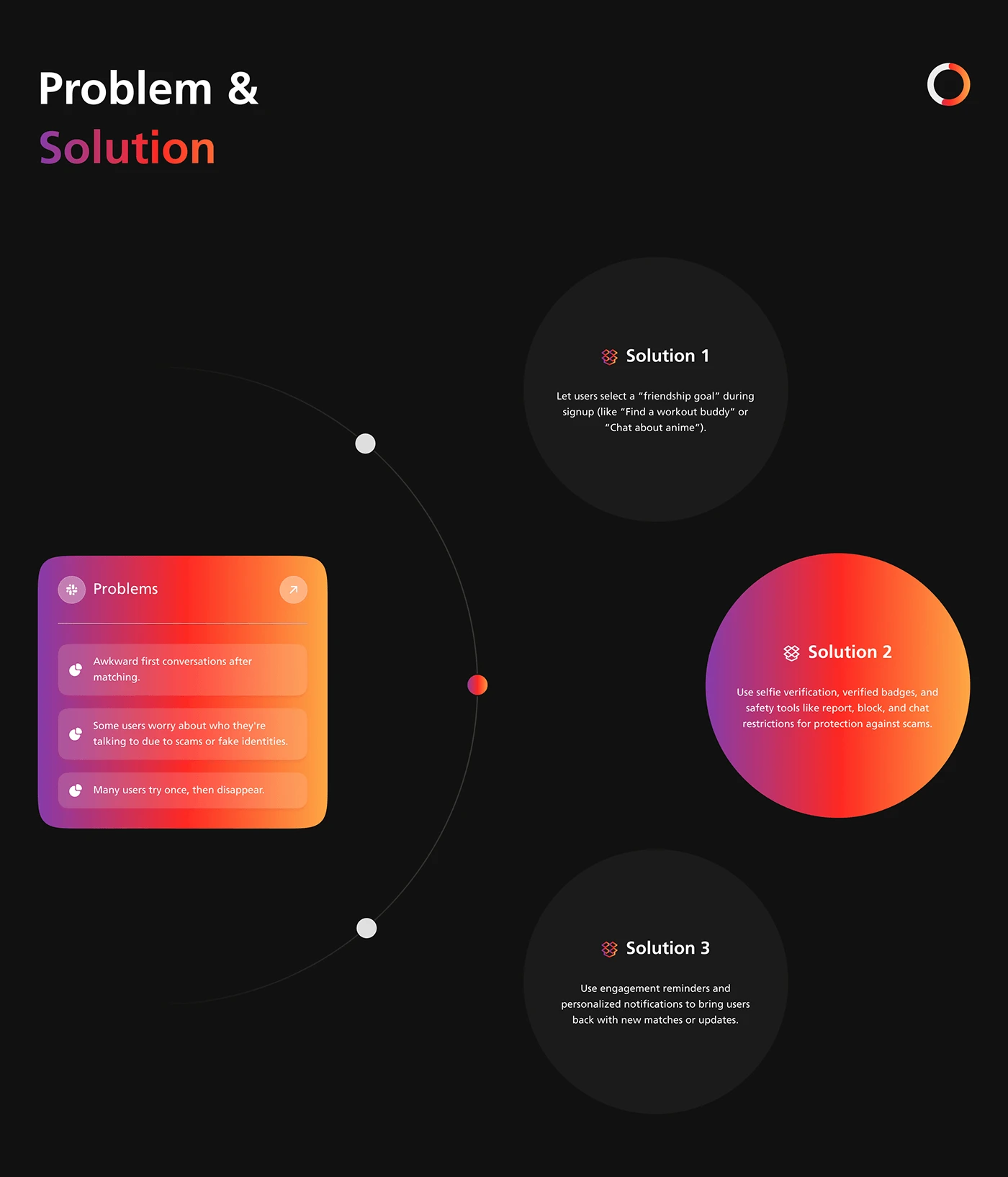
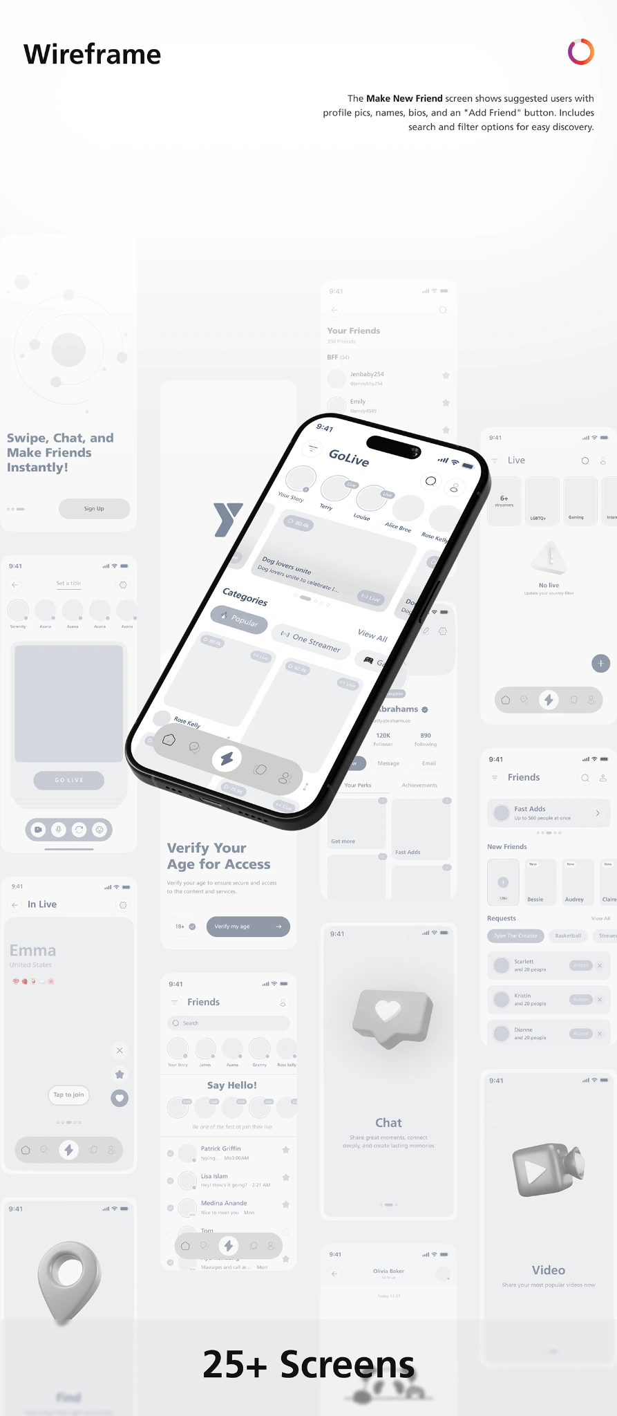
The planning boards connect the initial journey to discovery, profiles and messaging. Persona and problem-framing material provide design context; wireframes explore the structure before the final visual treatment.
Energy in colour.
Clarity in structure.
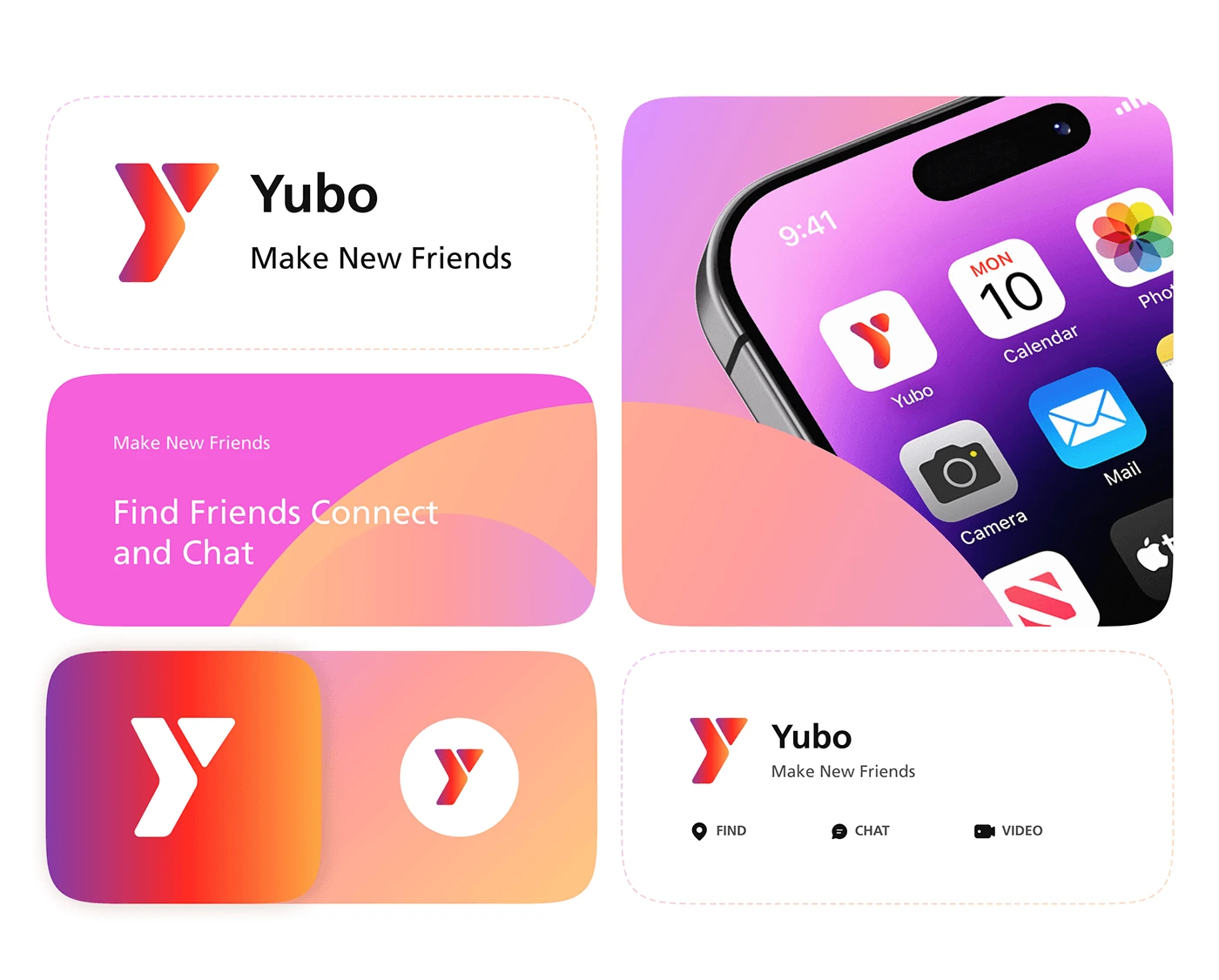
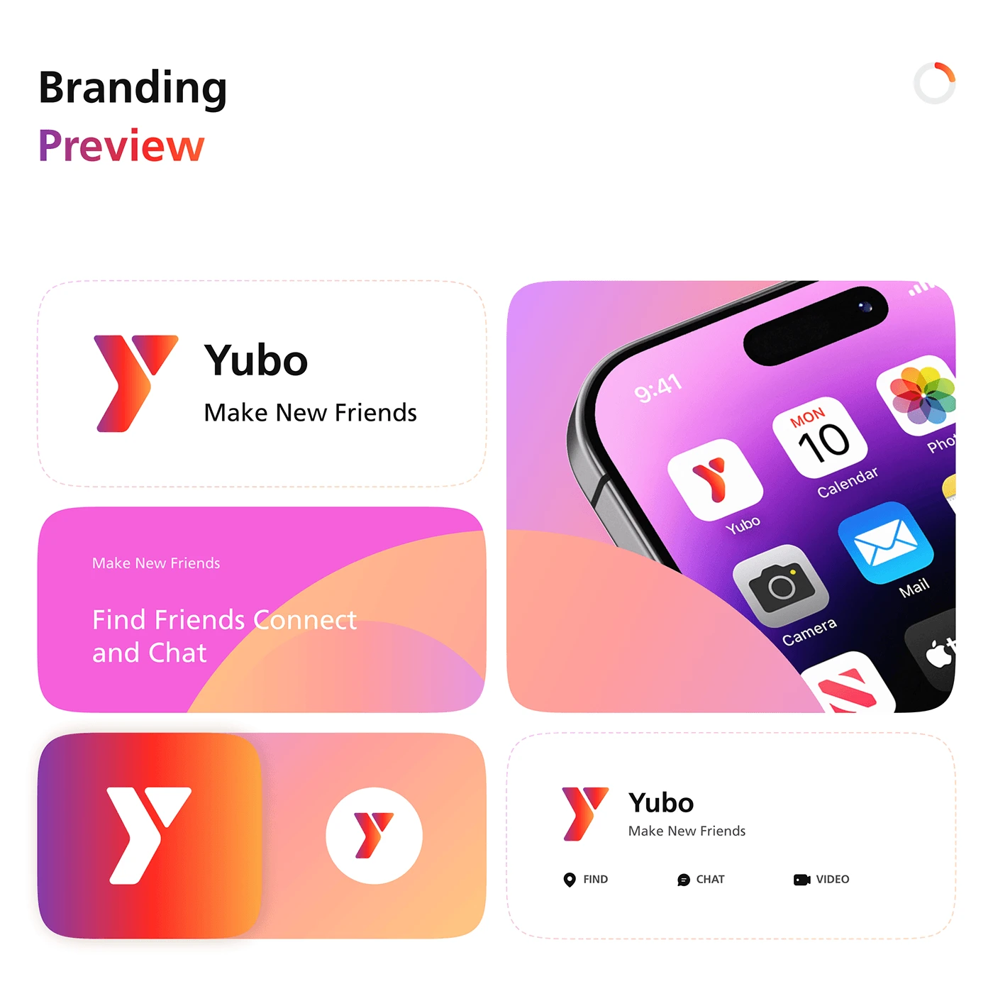
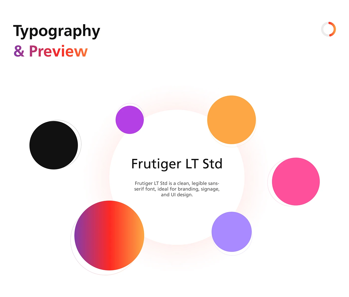
Purple, pink and orange bring warmth and energy to the visual system. The angular Y mark and gradient accents connect the app icon, interface and wider brand presentation. The typography board identifies Frutiger LT Std as the proposed typeface.
Discover someone new.
Make the next step clear.
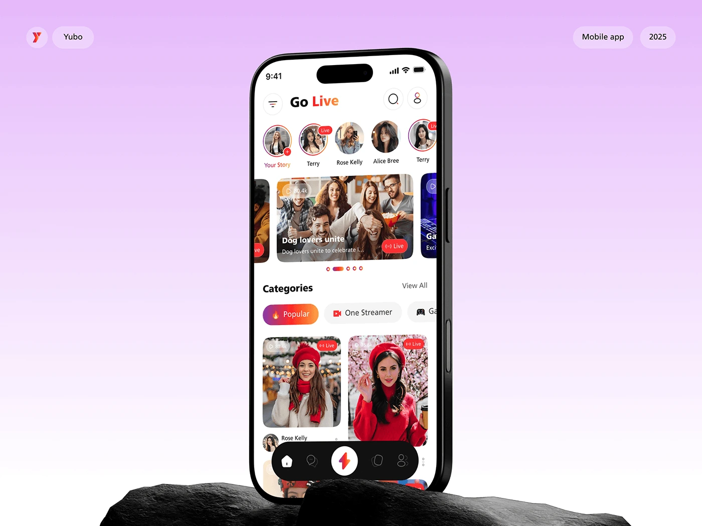
Discover. Go live.
Stay connected.
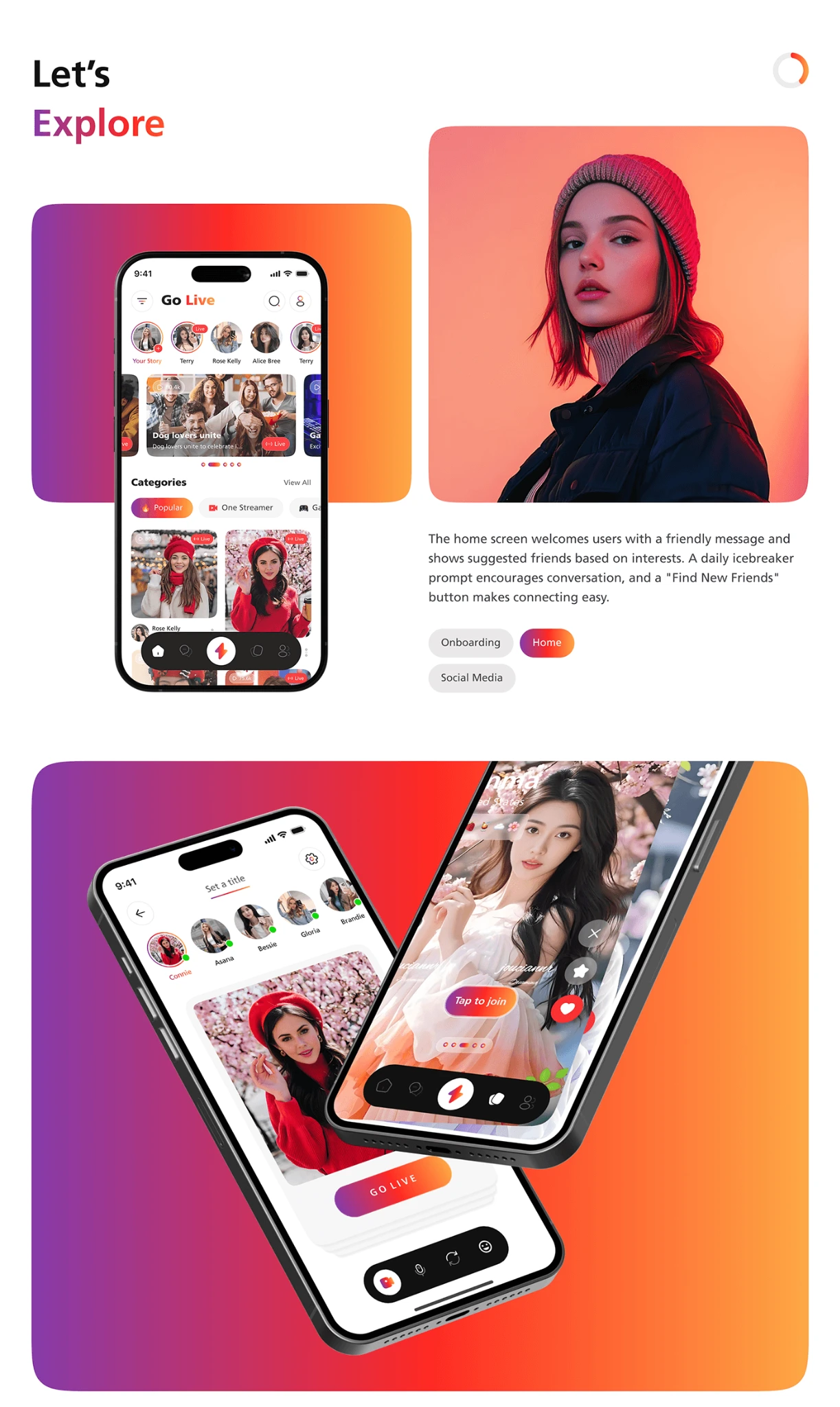
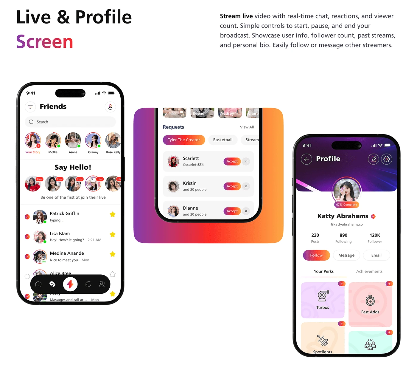
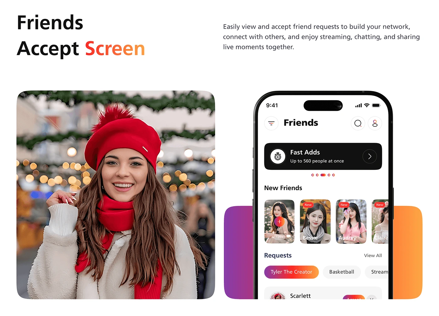
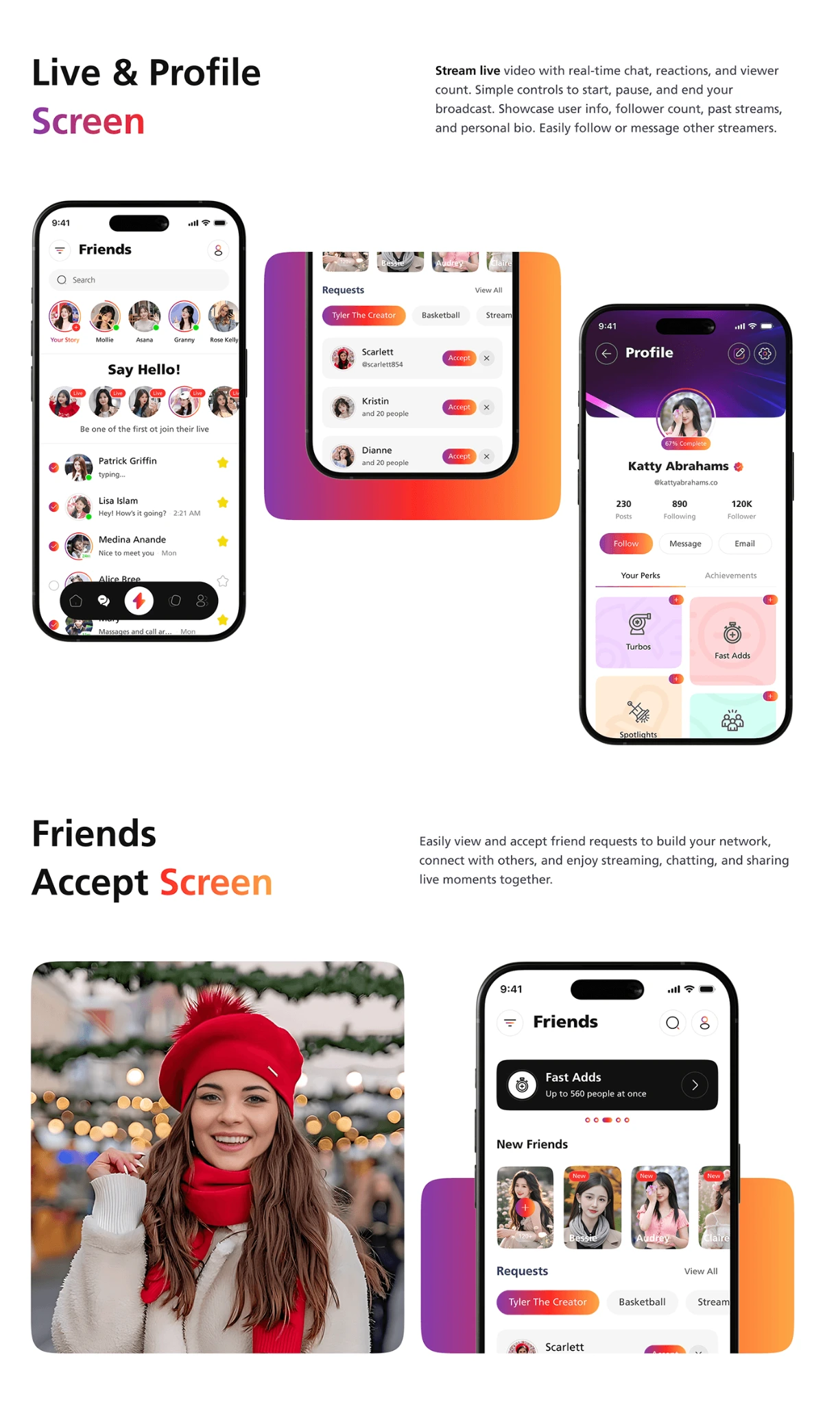
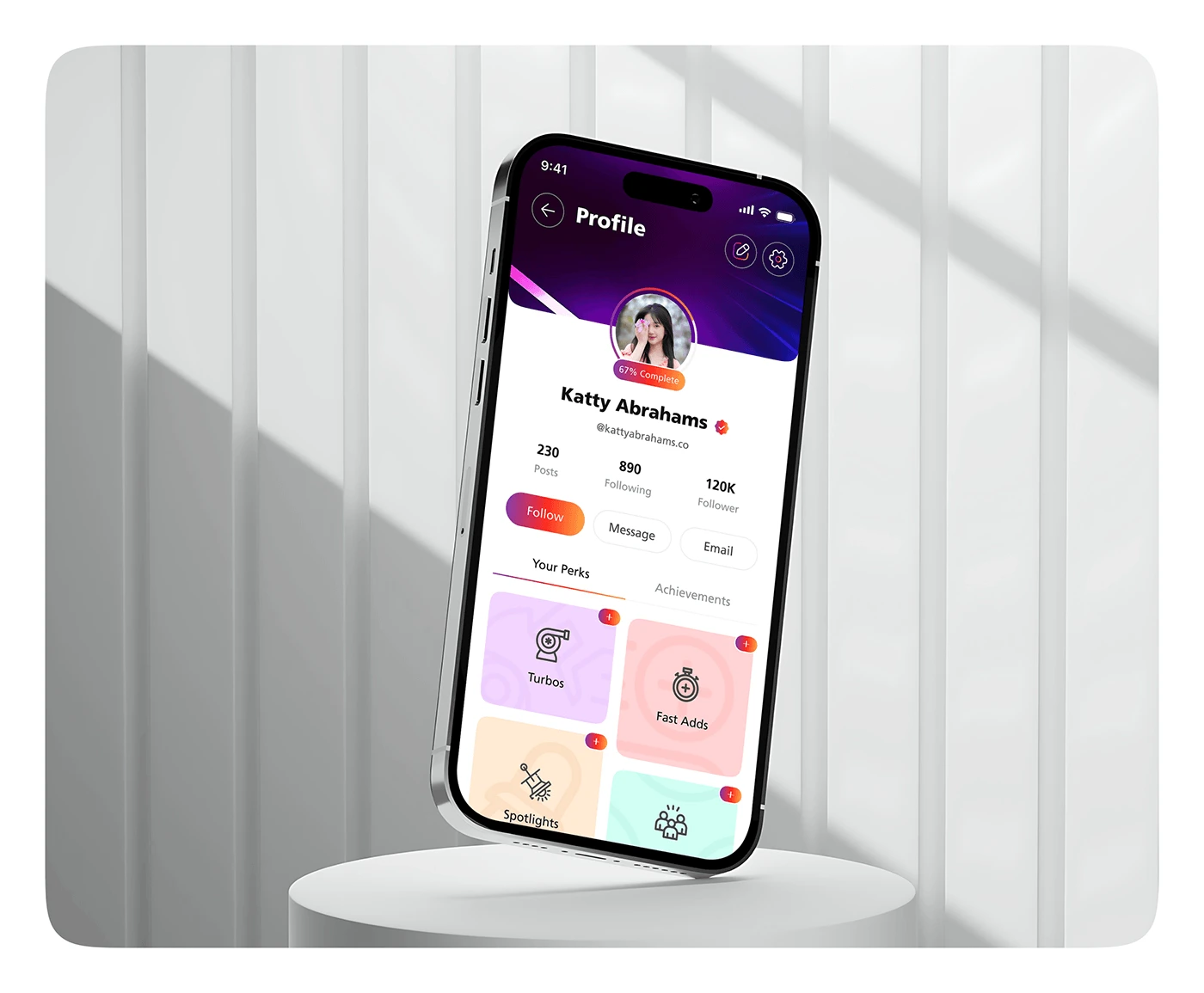
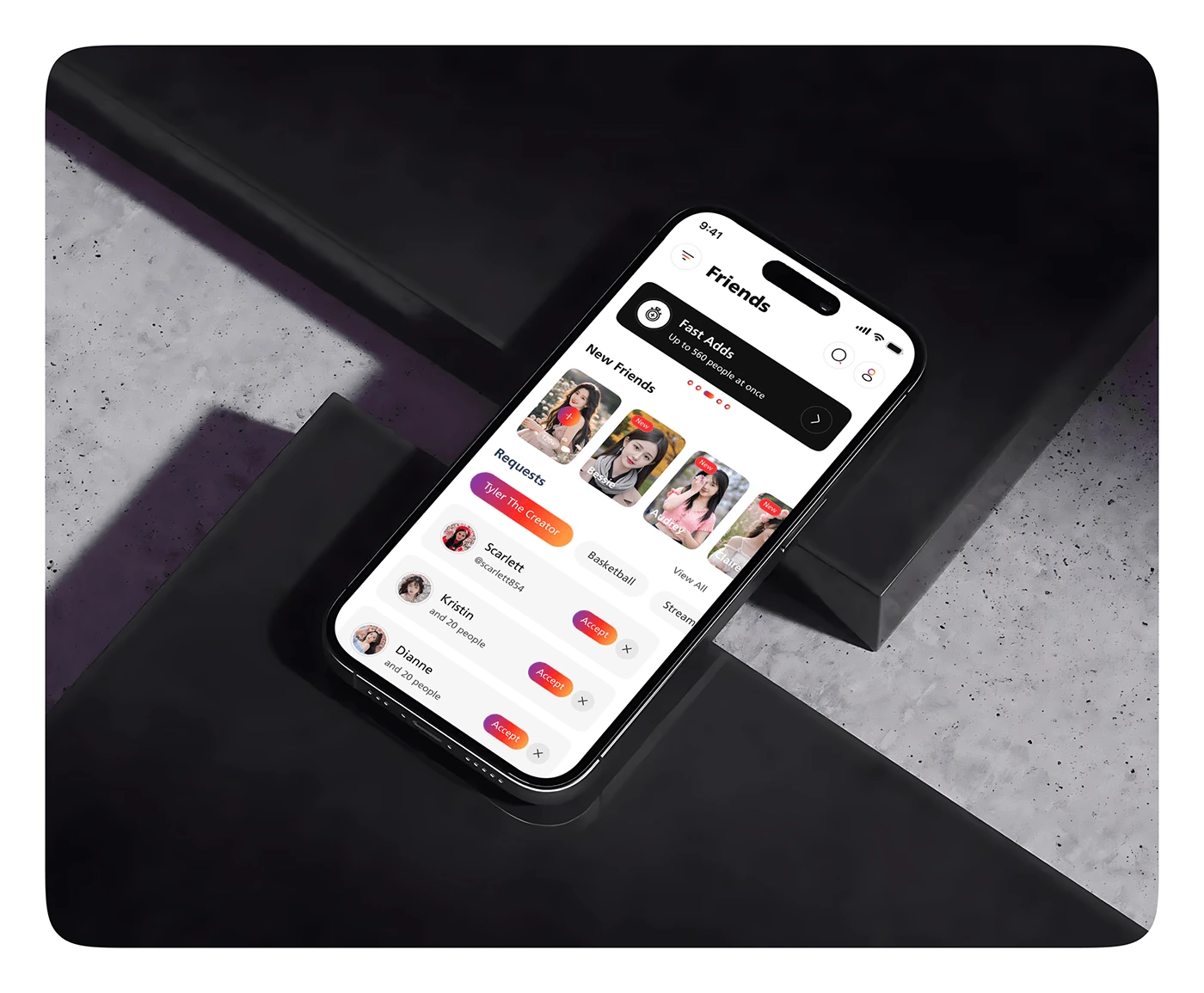
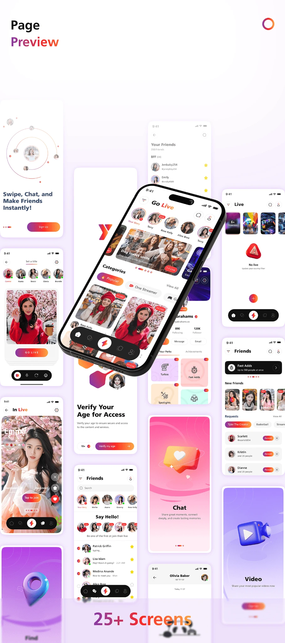
Discovery screens put people and live content first. Friend requests make the next connection visible, while profile views bring identity and social activity together. These screen studies and device mockups show how the visual system works across the experience.